Here's what it looks like built and screenshotted from a real device:
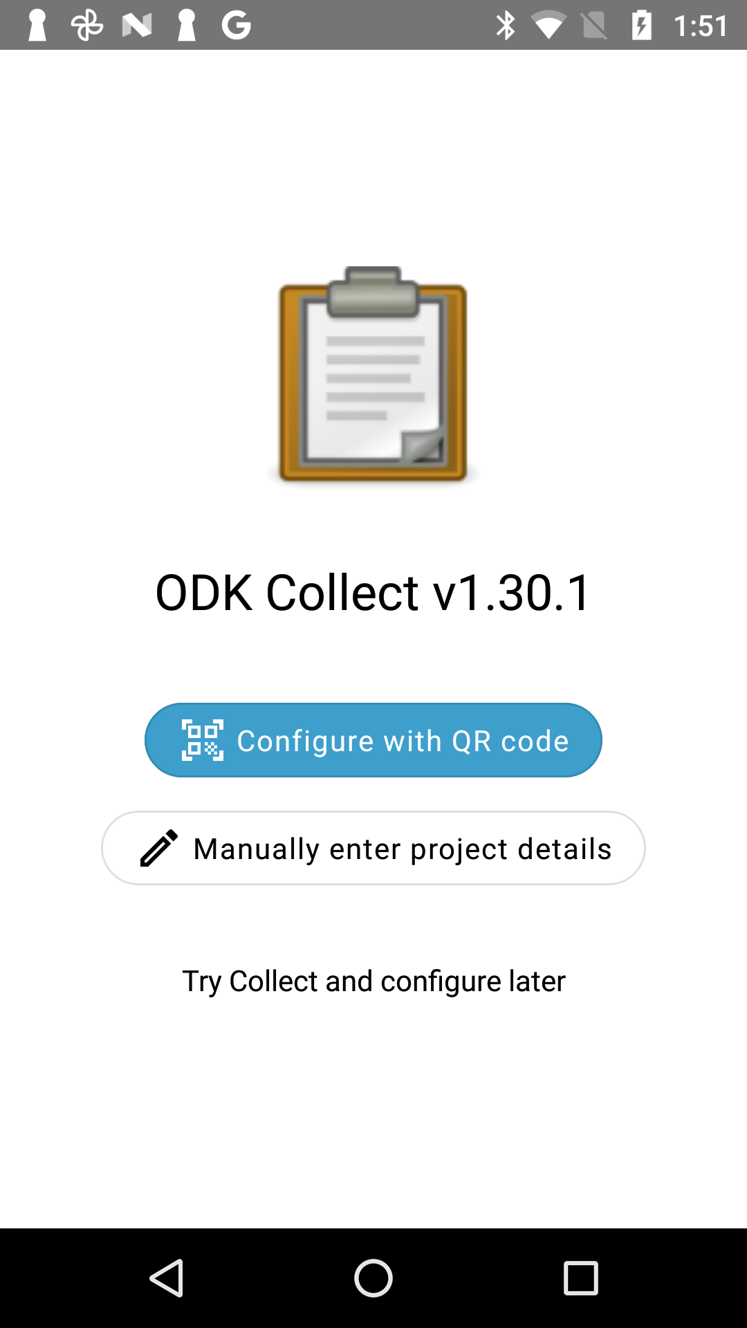
We're starting to introduce rounded buttons so it feels ok to do here. The implementation ends up being very close to the mockup shared previously.
Here are a couple other ideas. Note that mockups don't have fully rounded buttons for performance reasons of the template I'm using.
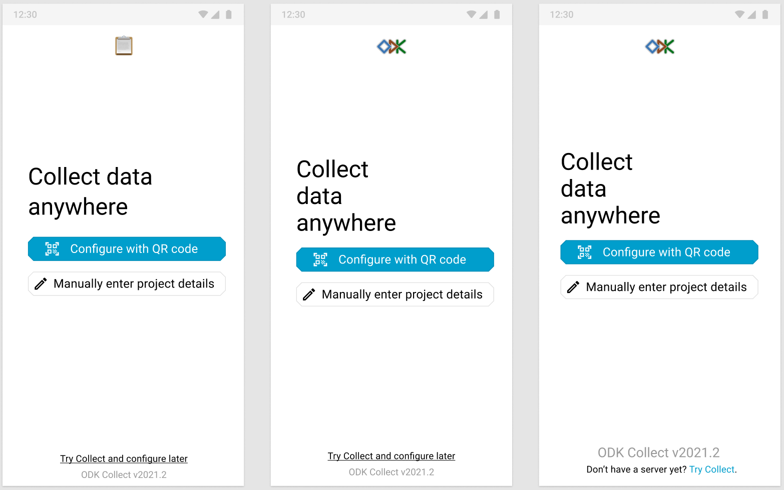
One underlying question is how important version checks by e.g. trainers are. We know it's more and more common for data collectors to use their own devices. We know one thing organizations have done to ensure a consistent data collection experience is to have a trainer "walk the room" to verify versions at a glance. That motivated the original large version text. With a small version at the bottom of the screen, it'd still be possible but the trainers would have to get pretty close. The last mockup is an attempt at maintaining the affordance of easily verifying version (say, at a 6-foot distance) without making the version front-and-center.
I like moving the "try" text at the bottom and adding some way to make it obviously clickable. I think the current implementation is not sufficiently clear. I think some of you may find the text in the last mockup friendlier.