What high-level problem are you trying to solve?
I’m thinking about a more user friendly start to navigating projects and forms at start-up of ODK Collect. This is kind of in tandem with Entity-first approach - making it easier for new users to adopt ODK Collect, but also make it a more visually appealing app.
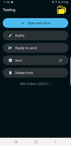
Keeping track of projects and associated forms is ‘hidden’, probably for good reason.- who thinks to tap an icon with a letter?
Any ideas on how ODK could help you solve it?
Projects are not intuitively visible, so changing the icon might be a good visual clue (e.g. the use of a ‘folder’ is indicative of multiple items). It could be a folder with a + if you only have one project?
This might help people adopt ODK for more ‘citizen science’ type situations if the app is easier to navigate between different Projects (maybe with a bit more information / summary about the project rather than just the URL?)
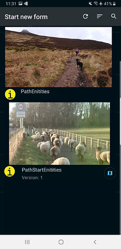
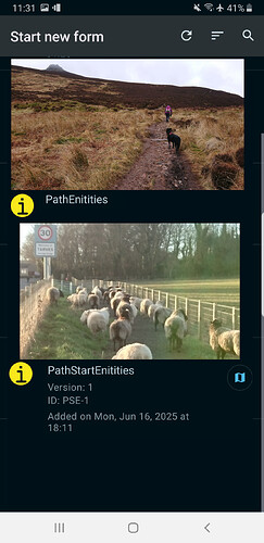
When starting a new form the ‘home’ screen is text heavy and not very inviting for those who are not data-focussed. Adding an image for each form and using a drop-down to show the form detail (e.g. version / date etc) could help in that direction without losing the important capability to check that the correct form is going to be completed. Data managers would be free to generate an image of a standard size, which could be a raster image of anything.
Upload any helpful links, sketches, and videos.
Some (rough and ready) mock ups to explain what I mean… Just as a starter. I know that the core team are thinking about these things, so I’m not trying to steal anyone’s thunder and welcome other ideas to improve these suggestions ![]()
Making projects more ‘obvious’:
Introducing images to the Start Form screen (tap on the image to start the form, tap on the i to get more information about the form):
Retaining ‘additional information’:
My thinking was to add a column in the form definition that relates to the image (and it be stored with other form media?) - it could be of defined size / proportion...


