A few people have been asking how to use images and icons in their forms to make them more visual and easier to use. I thought I’d share some quick tips to help you get started.
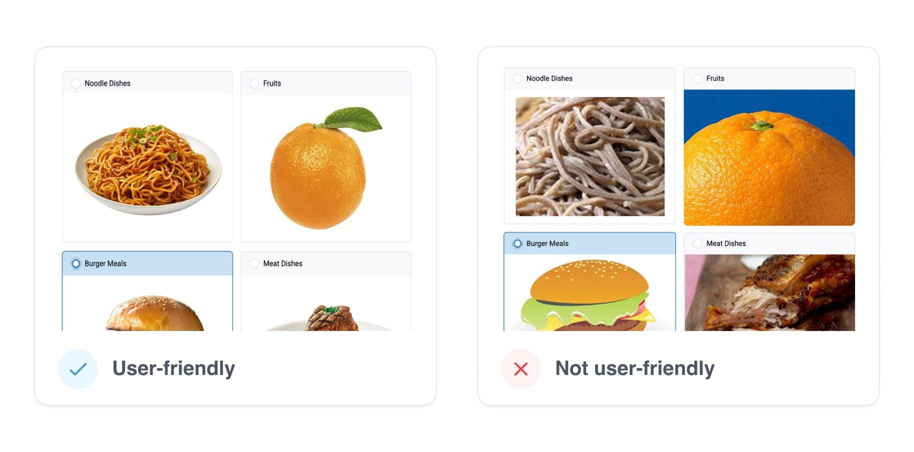
Tip 1: Use cohesive images to reduce cognitive load
- Make all images the same size (i.e. 300px x 300px)
- Use images with similar colors and contrast
- Add equal whitespace around the subject
- Ensure the subject is in the center of the photo
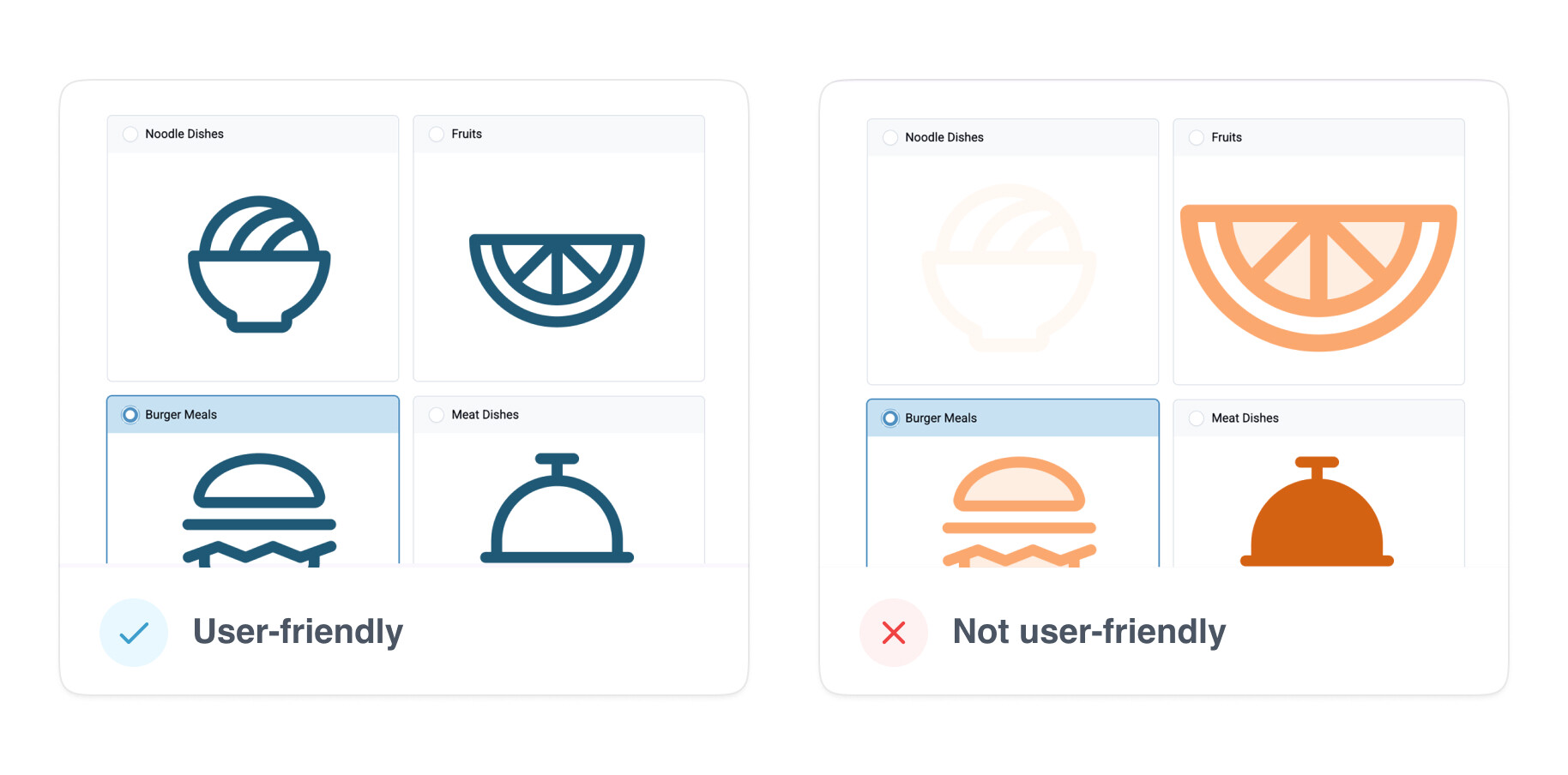
Tip 2: Use icons to simplify options
- Use open source libraries to find a cohesive set of icons (more details below)
- Ensure the icons are large enough to recognize and understand
- Pick distinct icons so users can tell them apart
- Use icons with high color contrast and test in both light and dark modes
Tip 3: Test columns-n appearance with users
- Get feedback on the layout that works best for your users
- Are they using smaller devices? What is the experience like with more than 2 columns? Sometimes presenting too many options can overwhelm users.
- If you are using columns packed, images/ icons need to be recognizable at a small scale
- Keep labels short and specific (long labels wrap making it harder to read)
![]() How do I use an icon library?
How do I use an icon library?
If you don’t have your own icon set, there are lots of great open-source options. Using icons from the same library, with the same style and weight, will make a better user experience. If one icon is big and bold in comparison to the others, it will slow down the user’s decision making process ––irregularity increases time/effort to make decisions Hicks Law.
Icon libraries
Once you’ve downloaded the icon, you may want to add some white space around it so the icon doesn’t touch the edges and look squished or unrecognizable. To keep it simple, you could make a copy of our icon template in google draw. Replace the image using your download icon library, and export the images.
You could also use a design tool like Figma or Canva’s icon maker to create equal spacing around your icon or create your own. I recommend checking out this article to learn more about the foundations of icon design and grids.
![]() How do I make images accessible?
How do I make images accessible?
Whether you’re using images or icons, ensure you use relevant text in the label to describe the image. There are ongoing efforts on including alt text for those who can’t view the image or using assistive devices. Read more.
![]() Writing image descriptions
Writing image descriptions
- Avoid writing “Image or picture of”
- Avoid long descriptions – keep it short and specific
- Focus on the details
![]() Related resources
Related resources
- Designing monolingual non literate forms and here
- Including media in choices (audio, video, and images)
All of these tips can be used for Collect or Web Forms. So let us know if find these tips helpful. Should we add them to the docs? Let us know below.