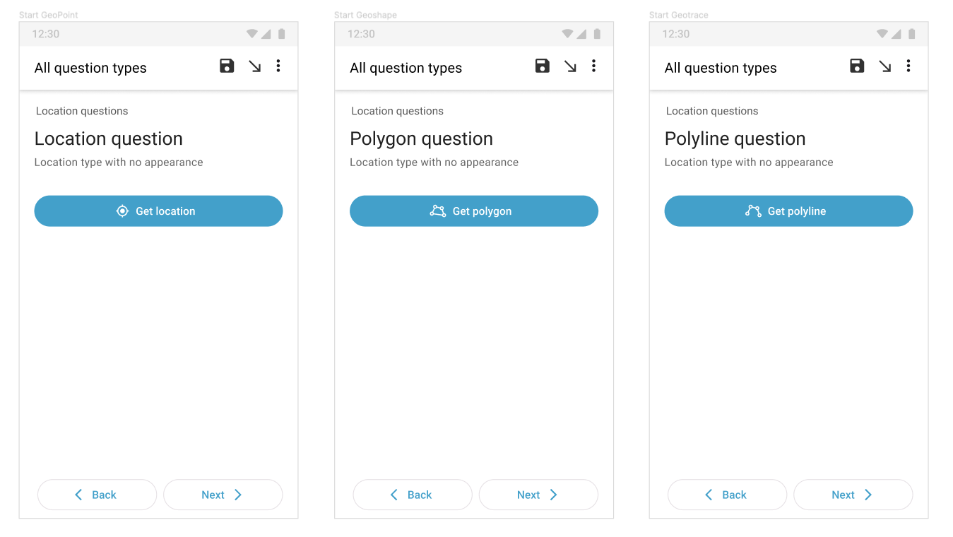
As you may have noticed, in parallel with deeper feature work, we’ve been introducing small improvements to the UI to make Collect more user-friendly. These improvements are prioritized based on what we hear in user research that we can address quickly. One of the design improvements we are working on in this release is updating the language in the geo buttons and adding icons to make them easier to recognize.
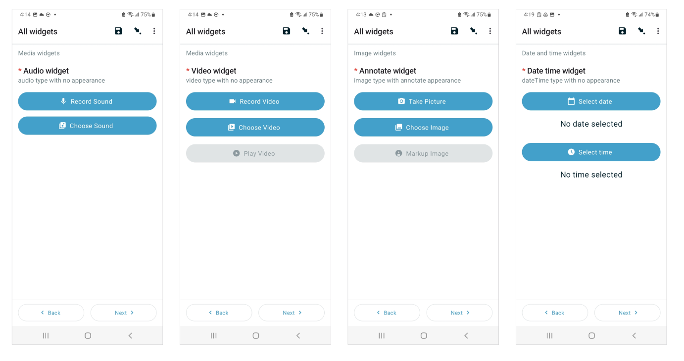
We hope this will make the geo buttons more usable for everyone, particularly new Collect users. We will also add icons to the other buttons (e.g., gather signature and record video), but we won’t update the language. Let us know what you think. We will also need help with translations
You're right Aly and as Joseph said : thank you for those "small improvements" that will probably help beginners to be more confident when they'll discover ODK
I would prefer: "Get ...", also for geotrace and geoshape. As they click/select points, don't "draw" really (as in image type appearance draw or annotate). Depending on the appearance they also can select/click for a geopoint type, and we use "Get" for the button. Also for geotrace, "points can be entered either by tapping the screen to place each point, or by taking readings of the device's geolocation over time."
Hint: We didn't encounter real problems so far with Start ... Geopoint / Geotrace / Geoshape on the buttons. (Corresponding to the ODK types). More important have been good training and manuals.
Thank you for the feedback! I'm glad to hear it resonates with you too. If you happen to come across other areas in the user journey that are confusing for data collectors, let us know
Hint: We didn't encounter real problems so far with Start ... Geopoint / Geotrace / Geoshape on the buttons. (Corresponding to the ODK types). More important have been good training and manuals.
Ideally, we want the interface to be intuitive enough that it's not dependent on training materials.
Sorry, I think, survey apps, will need good training, even if the UI is well designed. Even "polygon" is not a daily life word. (Maybe too many users think they can just start with the tool and do surveys without reading and training.)
Of course, I completely agree that some of these things require training, but our goal with these UI improvements is to make it more intuitive so folks don't have to return to the learning materials to remember what something means. The icons help with the learning curve.
"Add" might be a bit strange if you move back or review a form and just want to view what was entered/saved. Naming should also correspond to the further UI environment, please, e.g. title of map UI (or error messages), for Collect and Enketo.
We already change the button title depending on the state so it's different when there is vs there is no answer. It's also different in the read-only mode (at least in geotrace and geoshape). The new language will also need to have appropriate versions for those different states. @Aly_Blenkin started the topic by talking about the most common scenario (when there is no answer) but yeah maybe it would be better to see and compare the titles for all the states to choose the best combination.
As @Grzesiek2010 pointed out, we have different states for the geo buttons. Here is what we decided to go forward with based on your feedback:
States
"Start Geopoint"
"Start Geotrace"
"Start Geoshape"
If there is no answer
Get point
Get line
Get polygon
If there are answers added
View or change point
View or change line
View or change polygon
Read only
View line
View polygon
I also mentioned above that we are adding icons to the other buttons too. The goal is to illustrate what the button can do before you interact with it. We know some functionality will require training, but this will help with ease of use and reduce the learning curve for new users.
Here's a sneak peek of our work in progress (still working on the exact wording)