Thanks to everyone who shared their feedback!
As @Grzesiek2010 pointed out, we have different states for the geo buttons. Here is what we decided to go forward with based on your feedback:
| States | "Start Geopoint" | "Start Geotrace" | "Start Geoshape" |
|---|---|---|---|
| If there is no answer | Get point | Get line | Get polygon |
| If there are answers added | View or change point | View or change line | View or change polygon |
| Read only | View line | View polygon |
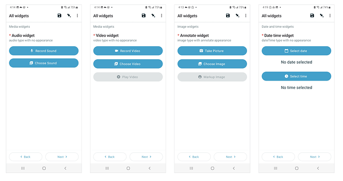
I also mentioned above that we are adding icons to the other buttons too. The goal is to illustrate what the button can do before you interact with it. We know some functionality will require training, but this will help with ease of use and reduce the learning curve for new users.
Here's a sneak peek of our work in progress (still working on the exact wording)
