1. What is the issue? Please be detailed.
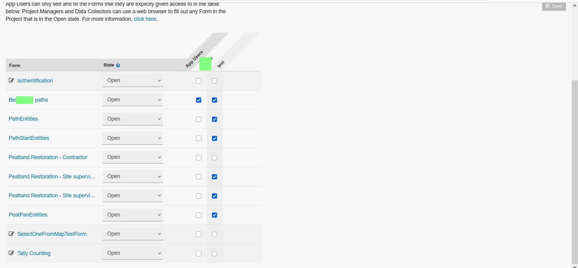
When viewing the Form Access page within a project on ODK Central, the column for the form name shows 34 characters (Firefox, 100% view). The pop-up shows 29 characters. The pop up does not show the Form id - which could help in some circumstances. It would be good to increase the width of the column.
This makes it difficult to differentiate between forms that might have similar names for the first 30+ characters.
2. What steps can we take to reproduce this issue?
3. What have you tried to fix the issue?
Changed the zoom level for the page - it helps, but only as long as I'm wearing glasses ![]()
Avoiding long form names!
I haven't yet upgraded to the latest version of Central - running v2025.1.2-1. Apologies if you've fixed it since I upgraded...
4. Upload any forms or screenshots you can share publicly below.
This is my 'testing' project - where I try to contain / restrict all my stupid errors...