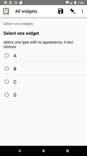
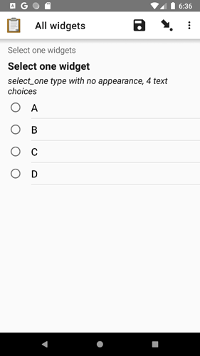
Thank you all for taking the time to try this and offer feedback. To provide a little more context, we want to increase the spacing because we have witnessed time and time again data collectors missing their intended target. Two recent videos showed this problem: https://youtu.be/kl9LXKf7b6c?t=343 and https://youtu.be/vR-jYWVfPS8?t=78. I completely understand that scrolling feels like a waste of time but missing a choice does too!
We'd really like to only add a setting if we really have to because adding settings increases the maintenance burden. Especially in this case, we have many select variants already so combining those with a new setting would lead to a lot of extra cases to get right and evolve over time.
That said, we hear you and the screenshots shared have helped illustrate the issues at hand. Thank you for that.
Here is a proposal that increases the spacing but not as dramatically as in v1.25.0-beta.0. I'd like to get this in another beta for you all to try. Hopefully you will find that it balances tappability and ease of finding a desired option.

