We are releasing an early beta for v1.25 to let everyone preview increased spacing in selects and confirm that the options are easier to tap on their devices. Another beta with exciting new features will go out in about two weeks.
ODK Collect betas are an opportunity to get community feedback on upcoming releases. If you have an ongoing data collection campaign, we recommend quickly verifying your form on a test device. The release will be delayed until all reported issues are fixed.
Joining the beta program
To join the beta program, find ODK Collect in the Play Store on your device (not in the web browser) and scroll all the way down. Please don't join the beta with a device or account actively used for data collection! In particular, note that joining the beta is account-based. If you use the same Google account across multiple devices, do not join the beta with that account.
Leaving the beta program
You can leave the beta program from the bottom of the Play Store at any time. Once you leave, you will get the next production update when it is released. If you need to go back to the previous production release, uninstall and reinstall the app. Your settings will be reset but your forms will remain (though backups are always recommended).
What to check in this release
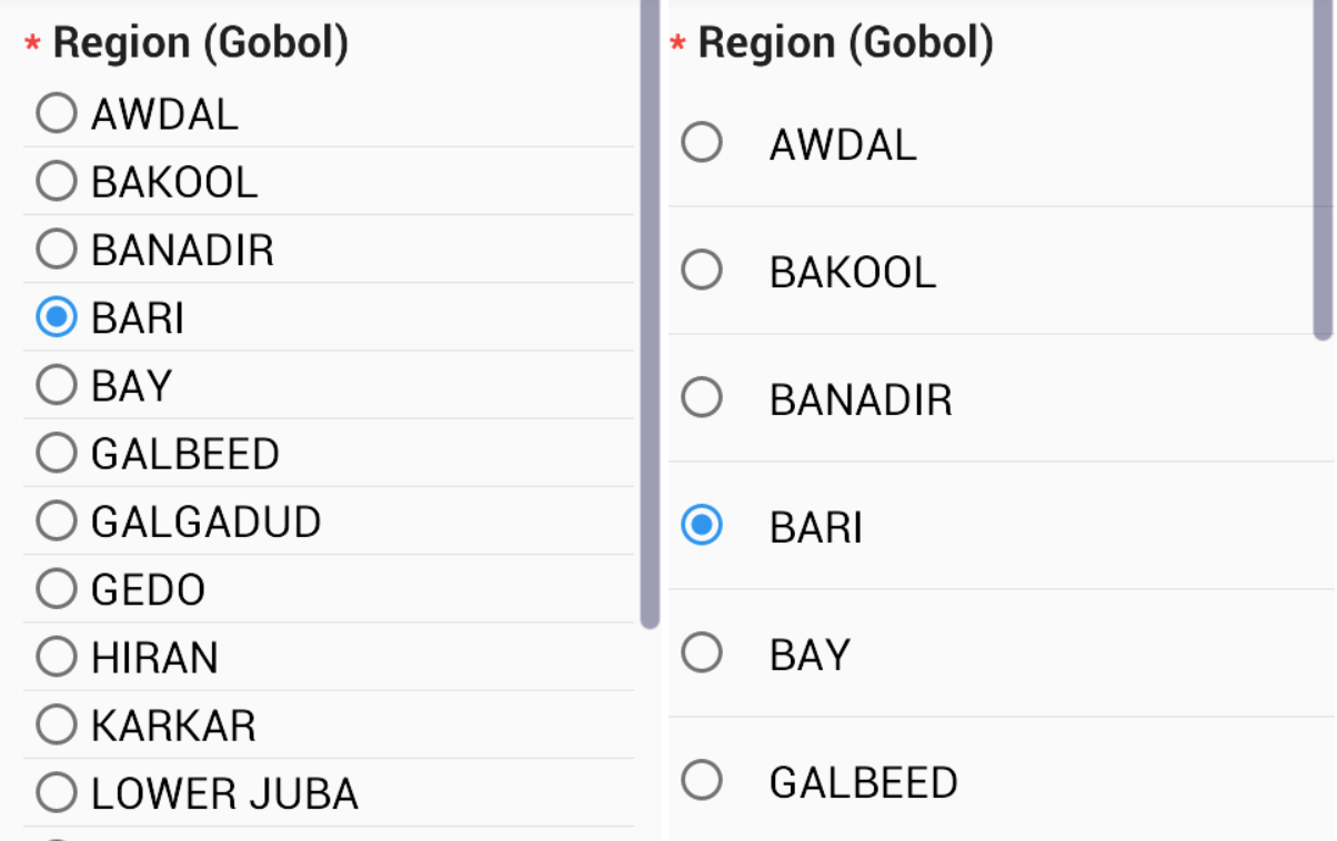
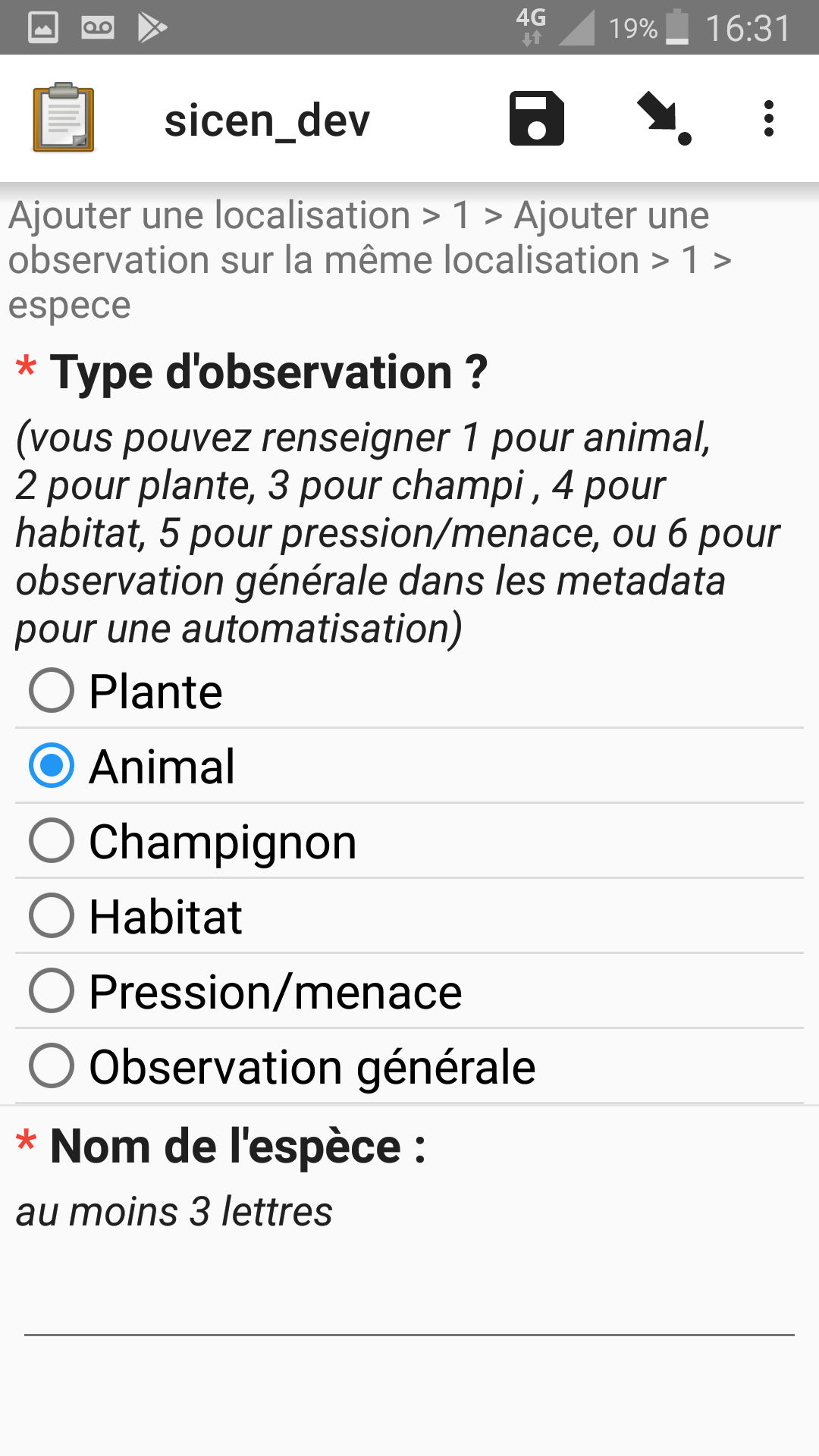
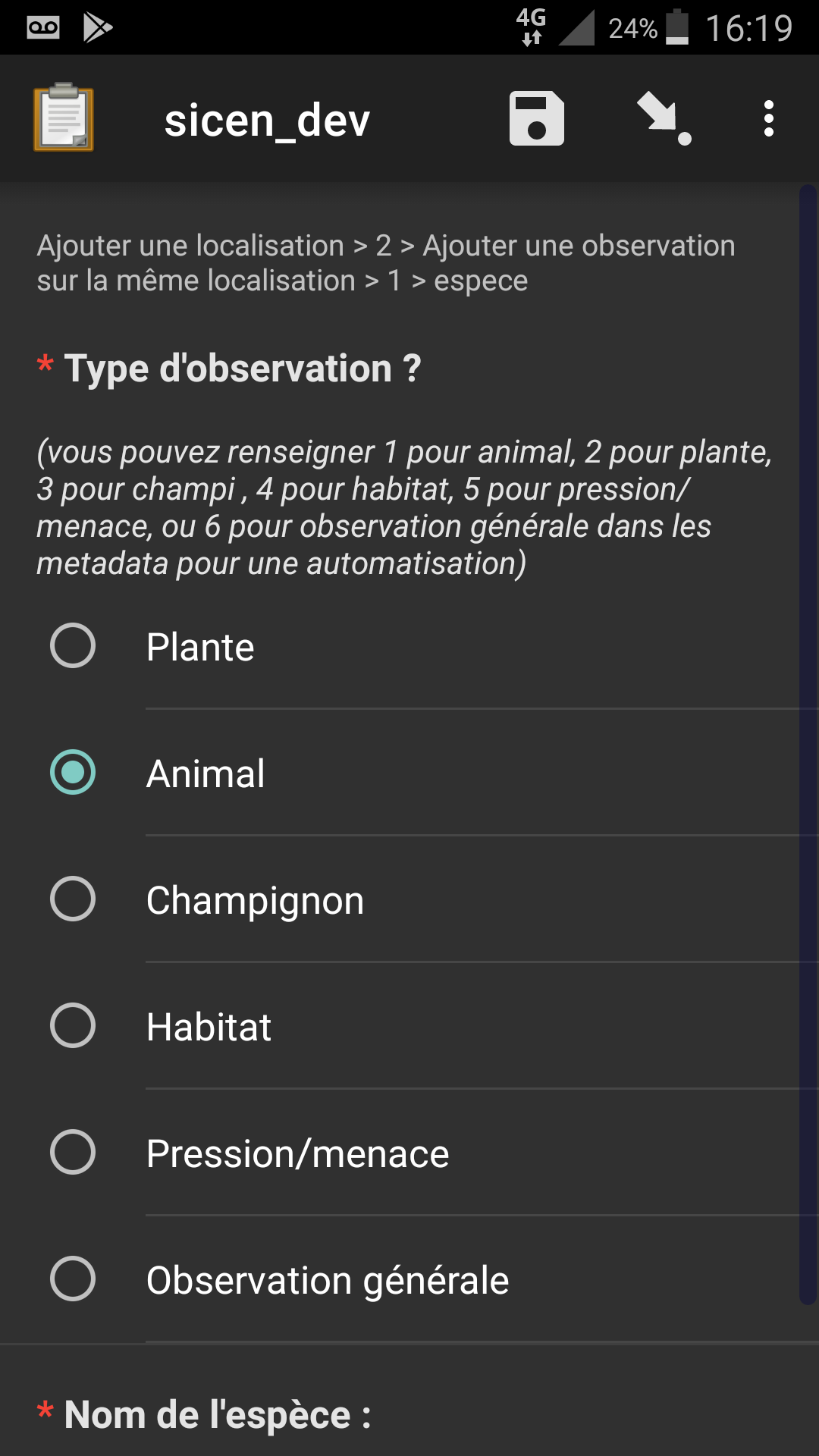
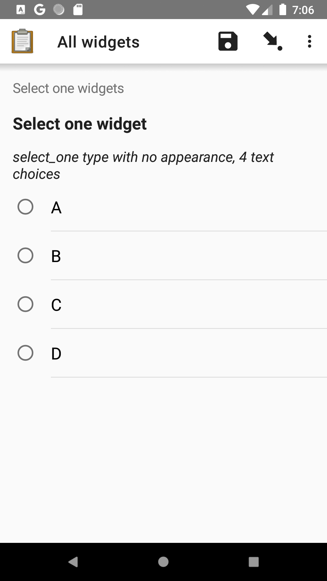
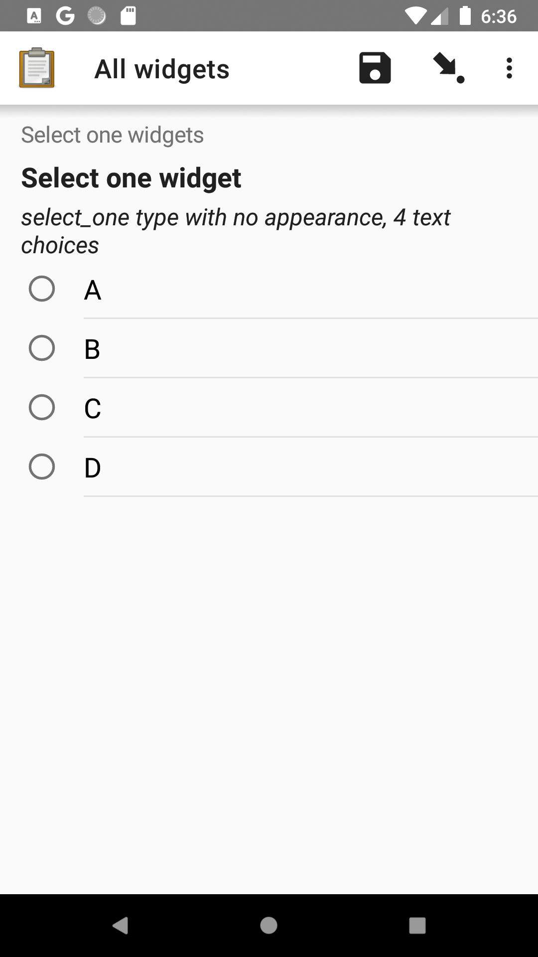
Verify that select options in your form are easier to tap.
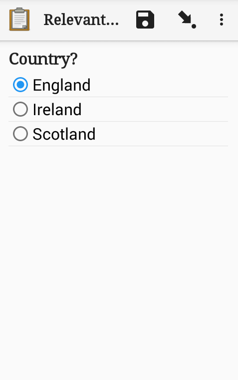
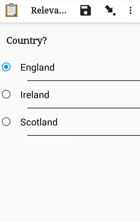
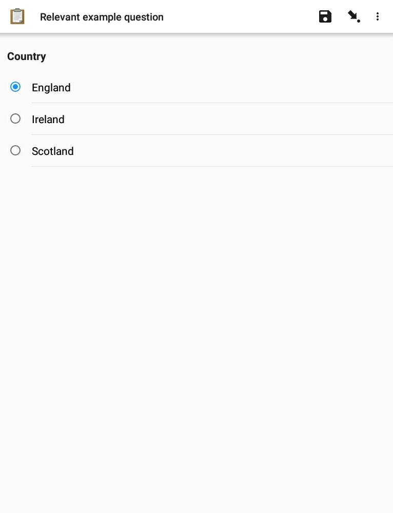
Select options have been close together to show as many as possible on small screens. ODK Collect users now generally have larger screens and selects close together are hard to tap. v1.25 will follow Android standards for spacing and look like the screenshot on the right:
In my opinion it is too much space between the answers.
eg if you have pictures in the answers or if you group some questions.
The questions have also to much space between the paragraphs
First example (look at the question and the answers):
new design
Hi Yanokwa!,
For my views, the spacing is quite much, if you have many questions and long list of answers as you have shown on your example it will be very cumbersome
Thanks
Mathew
I find the new spacing to be great improvements in the collect, it will easy the process of navigation in the form . Previously i have witnessed some enumerators having to be extra careful while selecting the option, and sometime having to re-select because of erroneous selection. I have tested in an 8 inch device and a 4 inch device. The selection is smoothly done.
Thank you so much to all who have tried out the beta so far!
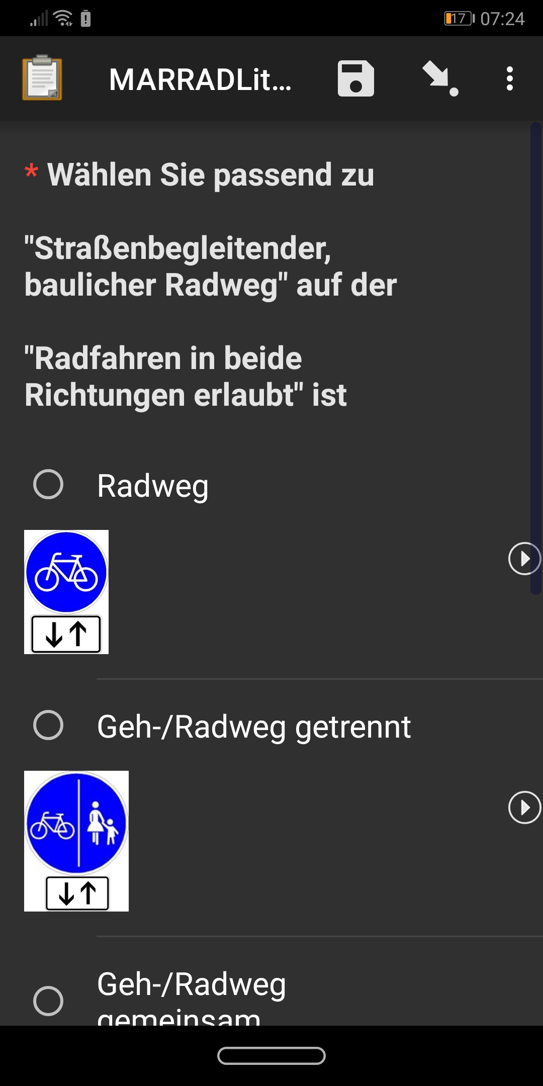
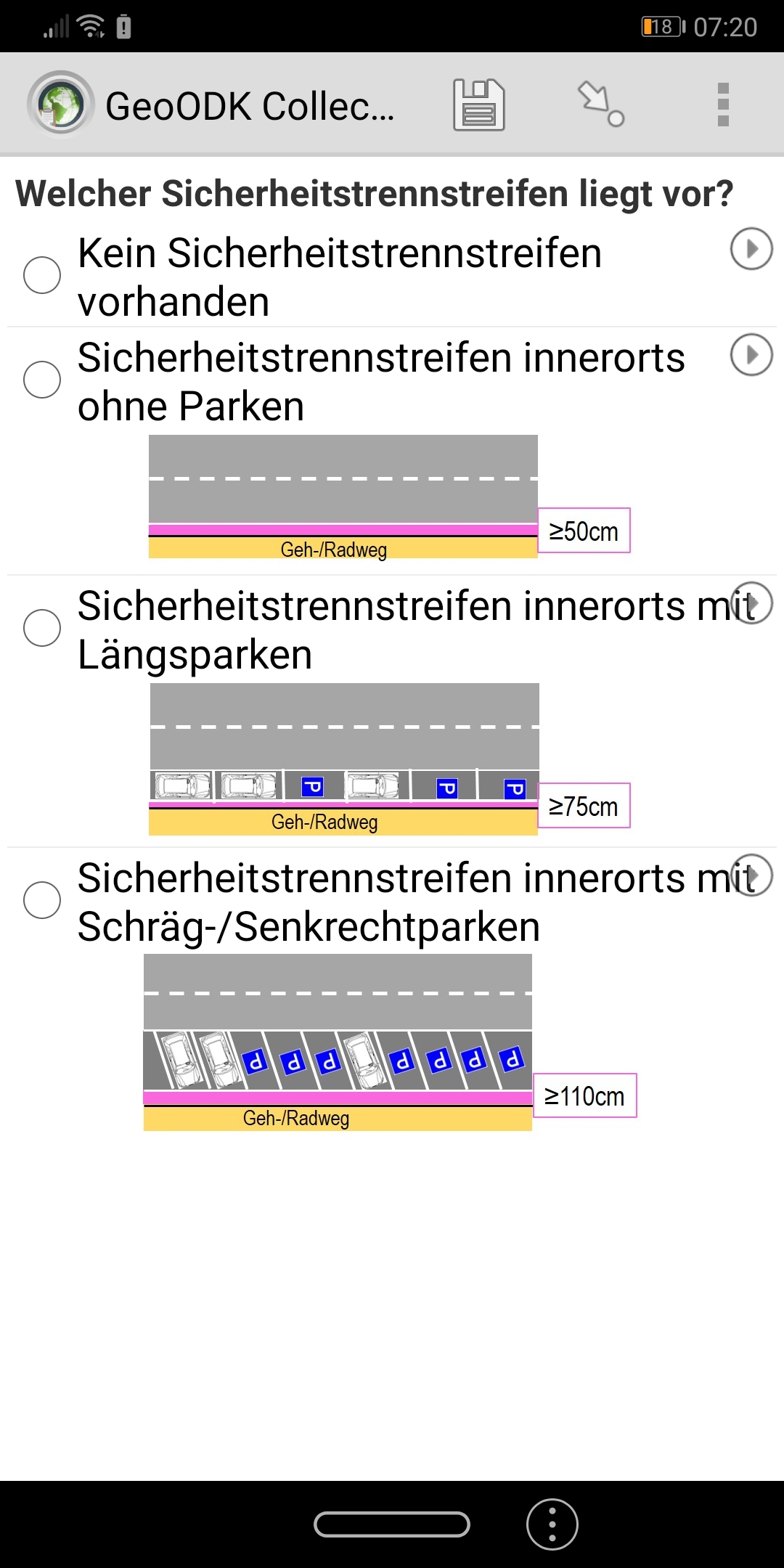
@Dominik, I have to agree that the change makes your scenario worse. Unfortunately, the combination of German which has very long words, multi-paragraph questions, a long and narrow device, and images makes things particularly bad. Thank you for including the screenshots as they provide a lot of helpful context. They also helped us realize that the question text margins were accidentally increased and that will be improved in the final beta. This should help a bit.
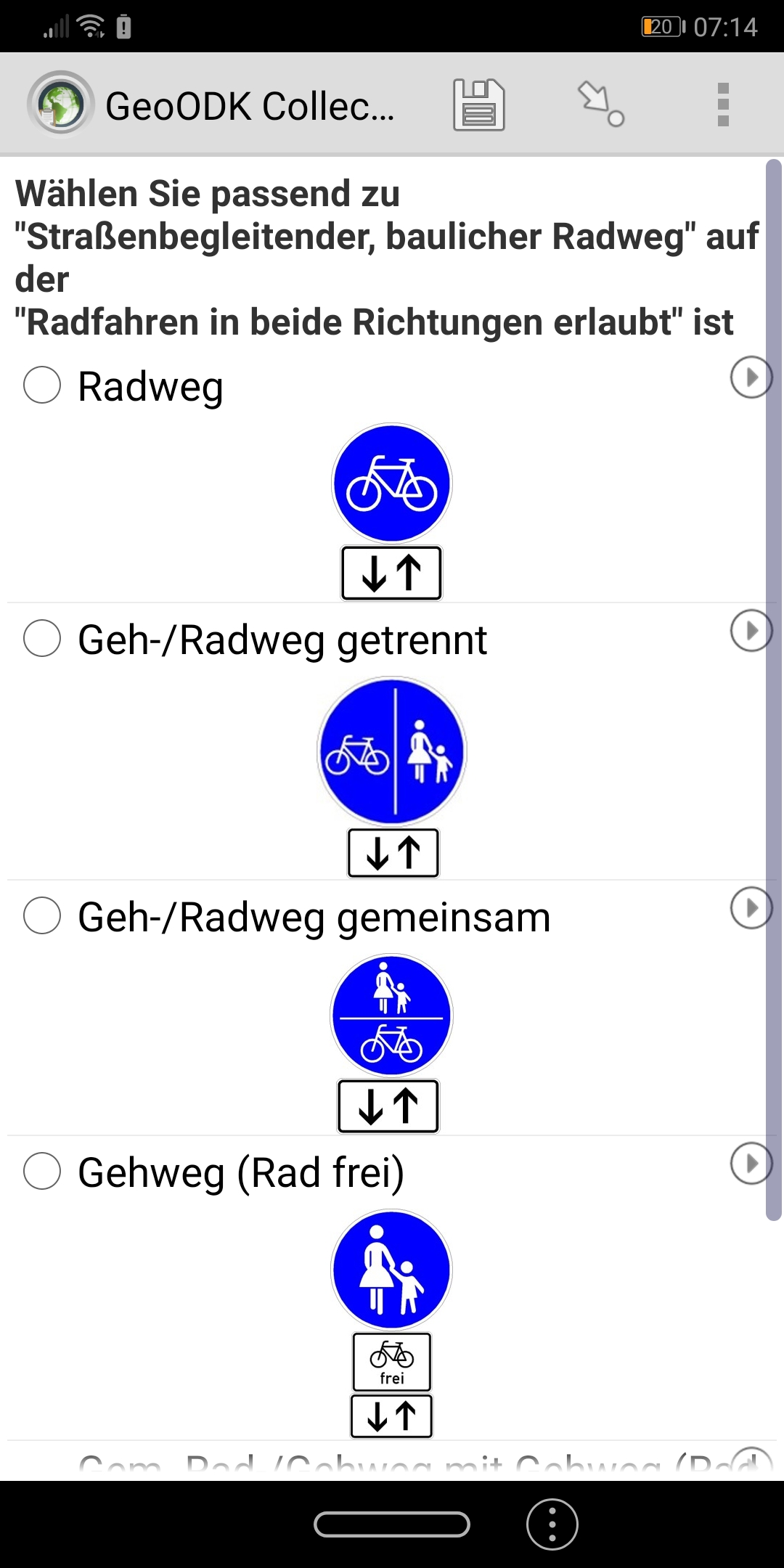
One big difference between the GeoODK screenshot and the one from ODK v1.25.0-beta.0 is the font size. In Collect, you can change the form font size from General Settings > User interface and I'd recommend going down one size to more closely match what you're seeing in GeoODK. I think that will make the increased padding less disruptive because your text won't take up so many lines.
@Mathew_Petro it would be helpful to get some screenshots or a description of your scenario to see if we can improve it somehow.
@Odil and @dicksonsamwel, I'm really glad to hear that the spacing is working for you!
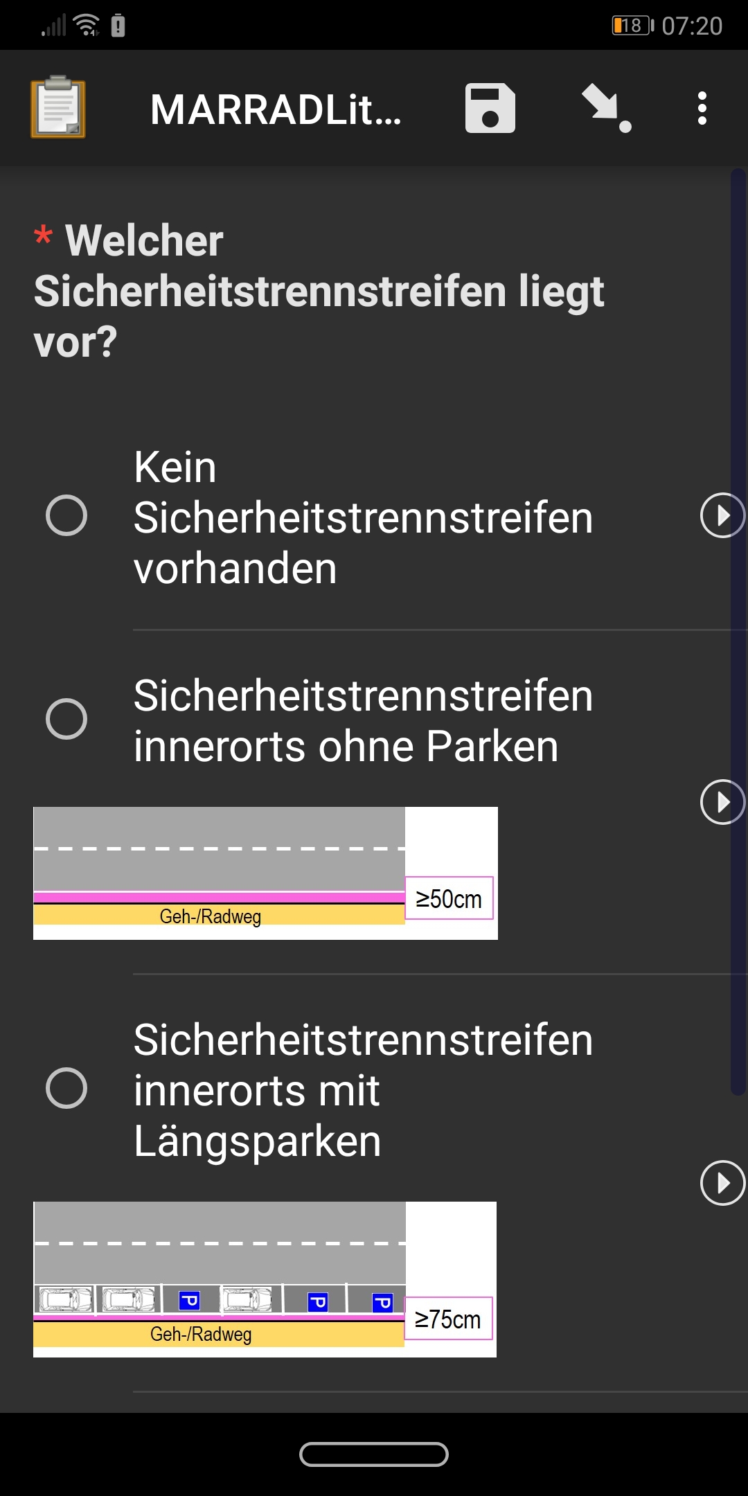
@dicksonsamwel, thanks for including screenshots. Is the small screen device running Android 4? The divider lines aren't looking quite right and I want to make sure we get those fixed.
I just tested this morning (in fact I wanted to test the new map functionality).
From my point of view and with my Galaxy S5, it needs me to scroll the screen where all questions where on the screen in the previous version
Could we imagine that this space size become a setting in the preferences, as the font size ?
@mathieubossaert Would it be possible to post a screenshot of the screen you're talking about? Interesting to see a before and after. Do you feel like scrolling will create a problem for people filling in the form?
@Dominik the new map feature isn't in this beta (assuming you're talking about this PR). Soon though!
I can only agree.
For complex and longer forms, the people who take the survey are happier the less they have to swipe, scroll or type.
I have several people on duty and that is the most requested wish.
Regards
Thank you all for taking the time to try this and offer feedback. To provide a little more context, we want to increase the spacing because we have witnessed time and time again data collectors missing their intended target. Two recent videos showed this problem: https://youtu.be/kl9LXKf7b6c?t=343 and https://youtu.be/vR-jYWVfPS8?t=78. I completely understand that scrolling feels like a waste of time but missing a choice does too!
We'd really like to only add a setting if we really have to because adding settings increases the maintenance burden. Especially in this case, we have many select variants already so combining those with a new setting would lead to a lot of extra cases to get right and evolve over time.
That said, we hear you and the screenshots shared have helped illustrate the issues at hand. Thank you for that.
Here is a proposal that increases the spacing but not as dramatically as in v1.25.0-beta.0. I'd like to get this in another beta for you all to try. Hopefully you will find that it balances tappability and ease of finding a desired option.
Thanks @LN for the videos, this really shows how it has been a problem that we had to live with. I find the new spacing will be a great improvement in collect. For complex / long forms with lots of text in the question title, I think there is a way we can live with that (long scrolling) unless we find it necessary to cut some words for simplicity.
Thanks @LN, in fact sometimes my colleagues choose the wrong line for example the species choice. But I agree that it does not have the same consequences as in the videos !
And my colleagues can adapt and be sensitive to the better accuracy in the collect offerd by a larger spacing. The screenshots with the intermediate spacing looks good. Ok to try it.