We have a lot of docs now... which is pretty great.
And they are sort of organized.
But putting pages into general buckets (Collect, Aggregate, etc...) has resulted in a very large sidebar doc tree, and it isn't easy to tell how all the sub pages relate to each other.
I'll be working during the next week or so to streamline the Tables of Contents and bring some order to this chaos.
This thread is a place to bring your suggestions on that process.
My current thinking is that most pages would stay in the general bucket they are in now, but that groups of pages would be collapsed into on-page TOCs, rather than everything being immediately visible in the sidebar.
For example -- I recently moved all the references to OpenRosa pages out of the sidebar and onto the OpenRosa page. This makes sense because the OpenRosa page acts as an intro to the other five pages. (This also allowed me to move the OpenRosa section out of it's own sidebar TOC and under the Developing with ODK section.)
I think something similar can be done with many other pages, but it isn't clear yet which pages make sense to collapse into sub-units. Specific ideas about this are welcome.
For me, I expect a similar structure and naming for the tool documentation and that lack of consistency (both in the structure and in the language) makes the docs less approachable.
Here's what I'd expect to see for each tool:
Overview (what problem it solves, typical usage, etc)
Installation (how to download, install, and configure it)
Usage (what each button does, how to do the typical things)
FAQ (e.g., projecting ODK Collect onto another screen)
Limitations (e.g., any gotchas?)
I think the FAQ (or Tips or Things You Should Know) is important because not everyone is going to dig through all the docs. And it's nice to have it in a list because it lets us document issues people commonly have and help users who browse that list get a sense of their unknown unknowns. It's also nice because it's documentation that contributors can easily add to.
I'm also wondering that there needs to be a higher level hierarchy? So the ToC starts focused on individual tools, then goes to Form Building, then Contributing, etc. That likely won't scale, so maybe we have a Tools section with the stuff I described above. Then we have a Techniques section with things like form design, deployment planning, integration, etc?
Looking at that might make it more clear the direction things are taking. (I recommend building it locally to really see what's going on. Looking at the toc trees in the source doesn't giove a great picture of how things appear.)
My big question at the moment is: Should the pages directly related to using the app be combined into a single page?
And the (solvable) problem here is that this list represents things at two different levels of granularity.
That is... Overview, Installation, FAQ and Limitations could, conceivably, each be a single document.
However, trying to make "Using..." a single document is difficult. It becomes monstrously large.
(I know, because I have a PR in that shows what that would look like.)
The solution options come down to two approaches:
tend toward aggregation
tend toward disaggregation
The current PR is option 1. I'm submitting a second one soon for option 2.
(I think I prefer option 2)
Either way requires finding a set of top level topics that function on about the same level of granularity.
So, both my aggregated and disaggregated versions will be a little different than what you suggested (but close).
Should the answers mostly be links to other content?
Is there any content that only belongs in the answer to an FAQ?
For example...
We have a doc on Projecting Collect onto a Screen.
None of the content of this page is really documentation about ODK Collect.
And it could be argued that this content would helpfully be placed in an FAQ page, under the heading How do I project ODK Collect on to a screen?
But:
That's a lot of content for a single answer in an FAQ. An FAQ page with lots of questions like that would be huge.
Why wouldn't we just make everything an FAQ?
How do I install ODK Collect?
How do I fill out a form in ODK Collect?
Where are the forms saved in the Android file system?
Is there something definable that separates a question like How do I make a repeating form question based on earlier answers in a form? and How do I turn an XLSForm into an XForm XML file??
Also, does something count as an FAQ question if lots of people ask it... but they wouldn't if they just knew about the docs and read them in the first place?
FAQs as an index of sorts
One idea that makes sense to me is that an FAQ is a essentially an index that links to other content.
How do I install Collect?
Follow the instructions here.
But then... is this useful? Should people just search for things? And would indexing on an FAQ just add an extra step in the searching process?
FAQs as "miscellaneous*
A common use of FAQ pages is that it is the place to shoehorn in all the topics you can't find another place for.
There's a logic to this. For example, with the Projecting ODK Collect onto a Screen.... this falls under Collect, but doesn't easily fit another topic, except perhaps other "catchall" categories like Tips or Best Practices. So then... how does one decide whether something is an FAQ or a Tip or a Best Practice?
Are there any software product "suites" with good documentation that you are looking at as examples? It would be helpful to see a few of these with different approaches. In particular, it would be helpful to see alternate approaches for usage or integration tasks (e.g. projecting Collect on a screen).
I took a look at the two pull requests that are currently up showing two different organizational options (https://github.com/opendatakit/docs/pull/357 and https://github.com/opendatakit/docs/pull/358) and I do like the second one with more separate pages. I personally like to search for things inside a page and when there's too much unrelated content in a page that stops being so useful. As a concrete example, I was looking for some information on installing Aggregate to AWS the other day in response to a question from @danbjoseph and when I searched in page I had to first go through the Tomcat, AppEngine, etc sections. I don't know how common that is but that's why I prefer smaller, more focused pages. Are there documentation best practices around long pages vs. short? Of course it's all about tradeoffs but perhaps there must be communal knowledge about how users generally consume documentation. If I'm the only one who searches within a page my experience is not very valuable!
One somewhat unrelated thing I wanted to bring up is that as more pages are added to the root directory it gets harder and harder to get to the README on GitHub. Could even just a sources/ subdirectory be introduced? I feel like I've seen that in other docs repos.
Are there any software product “suites” with good documentation that you are looking at as examples?
I've been looking into this. There are some, but none that exactly track what we're doing.
One example is the Python documentation, which Sphinx was originally built for.
It isn't exactly different components, but it sort of is, since the standard library is a collection of individual modules.
(Also, that is a very large documentation set, so looking at how they organize things would be good.)
Are there documentation best practices around long pages vs. short?
The general consensus is: smaller pages are better.
I agree with this, and what you said about the difficulty in finding things on large pages.
One somewhat unrelated thing I wanted to bring up is that as more pages are added to the root directory it gets harder and harder to get to the README on GitHub. Could even just a sources/ subdirectory be introduced?
Yes, we could do something like that, or even introduce sub folders. I've mentioned before my concern with this (changing URLs, difficulty in re-orging in the future) but it's becoming a concern that worth circling back on. I think I didn't realize quite how many pages we'd end up with.
I do like the second one with more separate pages
So do I, and it is more like what I've seen on other large projects.
I'm going to continue in this direction and iterate on that PR.
I think it is the most reasonable path forward.
I'm wondering if it makes sense to break things out further. I think the left-hand sidebar with all the different chapters is going to be only approachable to more technical users. How do we have paths through the documentation for those setting up ODK that are used to digging through documentation and those that might just want to quickly get started?
With many of the groups, I worked with people weren't really going to read the documentation at all (not to say we shouldn't have it)!
What are the use cases of our users most likely to be overwhelmed by documentation? How do we get them headed in the right direction?
At the very least I would have a very clear path for ODK-Collect users to go through and focus on that being really clean and for a completely non-technical audience. That is not to ignore the other documentation needs, but I think providing a more complicated path might be okay.
I don't think the InaSAFE documentation is perfect, but I'm wondering if combining the Table of Contents on the right with a bar across the top for specific software might work. Here is an example of what theirs looks like: http://docs.inasafe.org/en/index.html
I think the left-hand sidebar with all the different chapters is going to be only approachable to more technical users.
I'm hoping the current re-org makes that a lot clearer. But won't completely solve this problem.
How do we have paths through the documentation for those setting up ODK that are used to digging through documentation and those that might just want to quickly get started?
I agree with this. One of the things I'm planning to do, after the current round of reorg is done, is to create a way-finding front page. Something similar to the the front page of the Python documentation: https://docs.python.org/3/
wondering if combining the Table of Contents on the right with a bar across the top for specific software might work.
I like this idea. Also, this is consistent with a vague thought that I've been ruminating on...
The overall feel of the docs -- in design, organization, content -- is more like open source developer tool documentation than it is like consumer product end-user documentation. I think "productizing" the docs is a good direction to move in, especially for the Collect guide(s).
@yanokwa and I were talking about how users of Collect need a lot more "handholding" (what I call "UI Sherpa writing").
I try to avoid this sort of thing whenever possible because this kind of writing is tedious to do, and difficult to maintain. Also, in most consumer products, nobody reads it.
But -- it seems people do need it, and would read. So...
We can't completely alleviate the tedium, but we might be able to make it easier to maintain if we combined it with the upcoming project of automating the form-widget guide screenshot from an XLSForm (which @Divya_Rani will be working on during her Outreachy internship).
I'm thinking that in the source XLSForm, we could include prose instructions about how to use each type of field. Also, the Question and Hint text could be specifically educational for users. The output from the automation script could then be a page for form builders (showing what widgets are available, etc.) and a second page for users, showing how to use each type of question widget.
In my experience, these types of docs are used often alongside training courses. We would print out step by step documentation and use it to allow people to follow along. This was well walking through things on a projector.
It is tedious but in my experience frequently used in these types of trainings.
I'd appreciate @wonderchook and @yanokwa (and anyone else interested) taking a look at the WIP PR for this item:
I've reorganized the Collect pages, and also expanded the content, adding a lot of "UI Sherpa" stuff as suggested. There's more work to do here, plus general cleanup, but I think this is in the right direction for the content.
(A little design tweaking and way-finding will be next.)
I'd encourage those of you who are interested in the docs to give it a read through. The summary confirms that we are on the right path!
Overall, my impression of the documentation is positive. I like the site style and theme as they make the content clear and easy to read without being distracting. The writing is consistently clear and precise. Short, direct sentences dominate and superfluous words are mostly absent. I found extremely few information gaps. From a purely technical standpoint, I believe the documentation is quite good.
The main recommendation I have is to spend some focused time standardizing the content across pages. Most pages are internally consistent, but there are content formats that change across pages.
Headline hierarchy, grammar, and multi-step procedures
From the review:
It is my opinion that the procedures would be better served using ordered lists
I agree with this. I think.
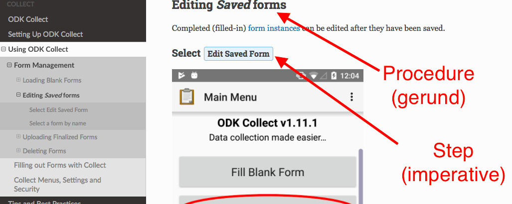
However, in my latest rewrite, I have added a number of screenshots to some procedures. To make the text of the steps clear, I made the steps headlines in the imperative case:
This makes sense (to me). But the potential problem is that not every procedure will be headlined at the same hierarchy level.
For example:
Loading Blank Forms and Editing Saved Forms are at the same level of hierarchy
Loading Blank Forms has several sub sections, of different ways to load blank forms
Editing Saved Forms has no sub-sections, the imperative-case procedure steps begin a the next level of hierarchy.
You may be thinking that one possible solution is to skip headline levels in sections like Editing Saved Forms, and making all imperative-case procedure steps <h6>.
However: In Sphinx (and well-formed HTML, anyway) there is no way to skip a headline level.
(Even if it was possible, I don't think it would be a great solution)
Possible options I see:
don't worry about; it's fine if procedure step headlines have different headline-levels
use the ..rubric directive for procedure step headlines.
create a new directive or text role just for procedure step headlines
don't use any kind of headline style for procedure steps, just keep them in normal text
I like the last option the least. I think single-lines of body-text are hard to find sandwiched between screen shots that also have text on them.
I'm inclined to the first option, but I don't want docs readers to get confused, even subconsciously.
The rubric option is interesting. I'm already using it in a few places where it seemed right, but I haven't concretized what situations call for it and which don't.
Which leaves, I guess, the custom option. Not a big deal to implement (a few lines in conf.py and custom.css). But I don't want to add things like that unless they are really needed. (There's always some catch or problem, even if I can't predict it.)
So... is it really needed?
A response from Matthew Helmke, the author of the docs review posted above...
First, let me be honest about my biases. I don't like procedure steps as headers. As a reader, I want headers that help me find the procedure and I want a procedure that fits as close as possible on one screen so I don't have to scroll up and down while following/performing the steps. This is simple, easy to maintain, and so common that the reader doesn't even think about, they just use the content.
One thing that can help with this is to put screen captures in a expandable/collapsible box, so that the reader can read as many steps as possible at a glance. This helps the reader quickly remember where they are in a procedure, especially a longer one, while also providing access to the screen captures as a road sign, if needed.
That said, I have seen procedure steps used as headers, but it takes some serious work to get it "right." What you must do is make it obvious to the reader that each headers is a step in a longer procedure. There are ways to accomplish this, for example:
You could number them with something like "Step 1" or something, but you would have to do that manually and it becomes a pain in the ass to maintain over time.
You could introduce the procedure at the top of the page with a short note telling the reader that each headers is a step and that smaller headers are sub-steps of larger headers. This runs the risk of being skipped and either way begs us to ask why we have designed documentation that we must also instruct the reader how to use. They should be able to focus on the content and getting their task done and our formatting should get out of the way and help the reader do so as quickly and easily as possible.
I'm sure there are other options out there.
To be honest, I would like to gently, but strongly suggest against doing this. If you decide you are going to anyway, then I find the suggestion of using gerund forms to delineate the start of a procedure and imperative forms for the steps to a welcome step in a good direction.
I agree with him and have started working on implementing his suggestions.