Assumptions I'm making at the top:
- Collect is moving towards Material design rather than away from it
- As part of the above assumption, we are happy/eager to start using the Material Components library
I've been looking at doing a "rework" of the typography within Collect with an aim of it being more consistent for both users and developers. This is part of a broader piece of work focused around improving the Collect's UX/UI in general but the jumping off point for typography specifically is based on @zestyping's excellent adventure through Collect in this document.
Material Theming
After playing around with some different approaches for how we could make some positive changes in the app I'm now looking at using Material Theming as the backbone of how we could move forward. Like a lot of design ideas that have come out of Google, Material Theming's docs can be grandiose and some times a little abstract so I'll try and sum up what it is: Material Theming is a standardized set of attributes for color, text and shape that define a "look and feel" for an application using Material Design's components. For those interested here's last year's I/O presentation announcing the concept and tooling.
In Android terms, Material Theming is a set of known attributes that we can customize and that will then dictate the style of Google's Material Components library within our app. If you go one step further and use Theme.MaterialComponents as your app's theme then components like the Toolbar and status bar will also be styled using your Material Theming attributes - this is where I'd hope we can get to in the future.
As well as the Android Material Components and Themes, Google has introduced tooling for designers to help them "build" the theme. As an example I used the Material Theme Editor for Sketch to create a theme similar to the current look and feel of Collect:
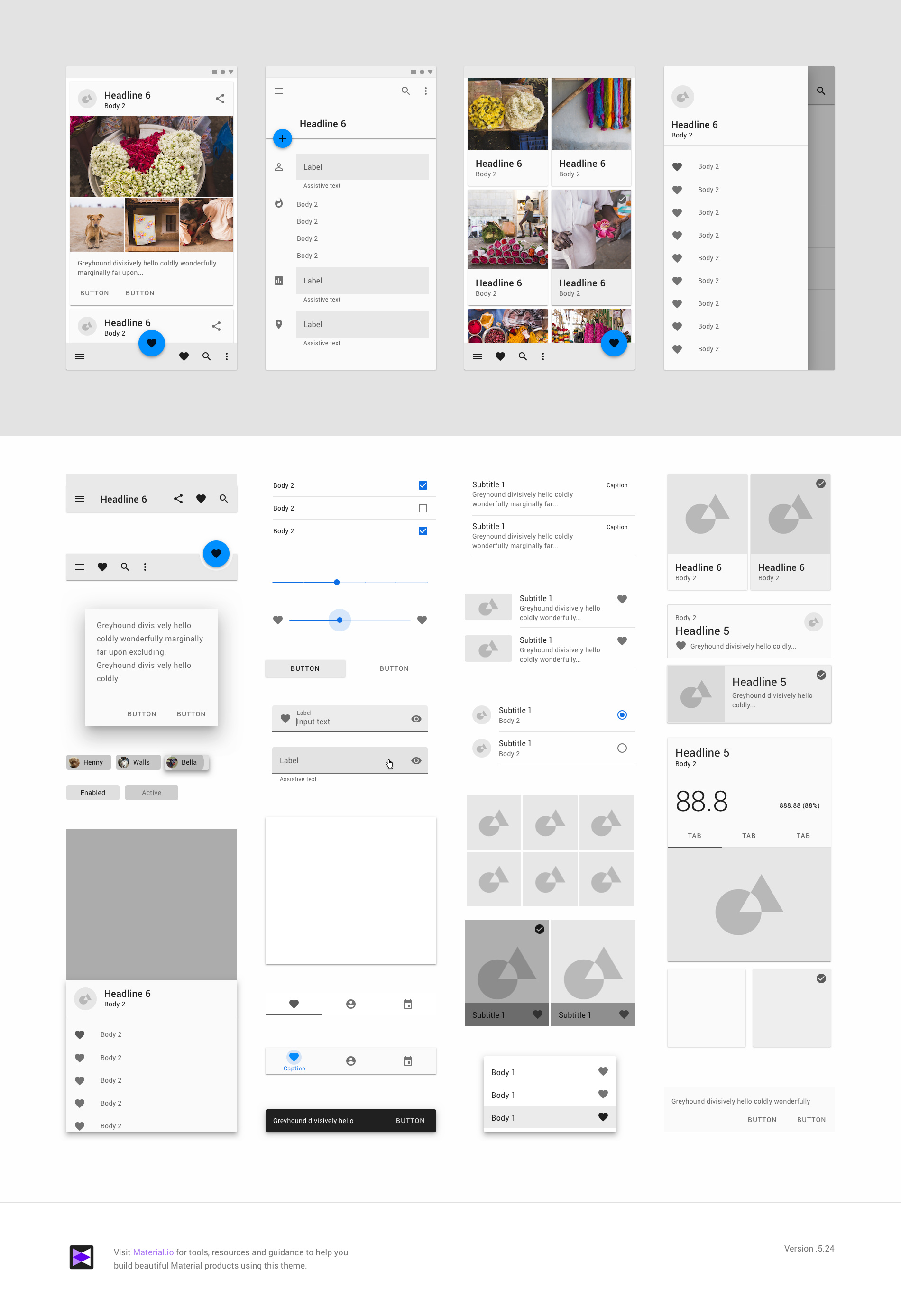
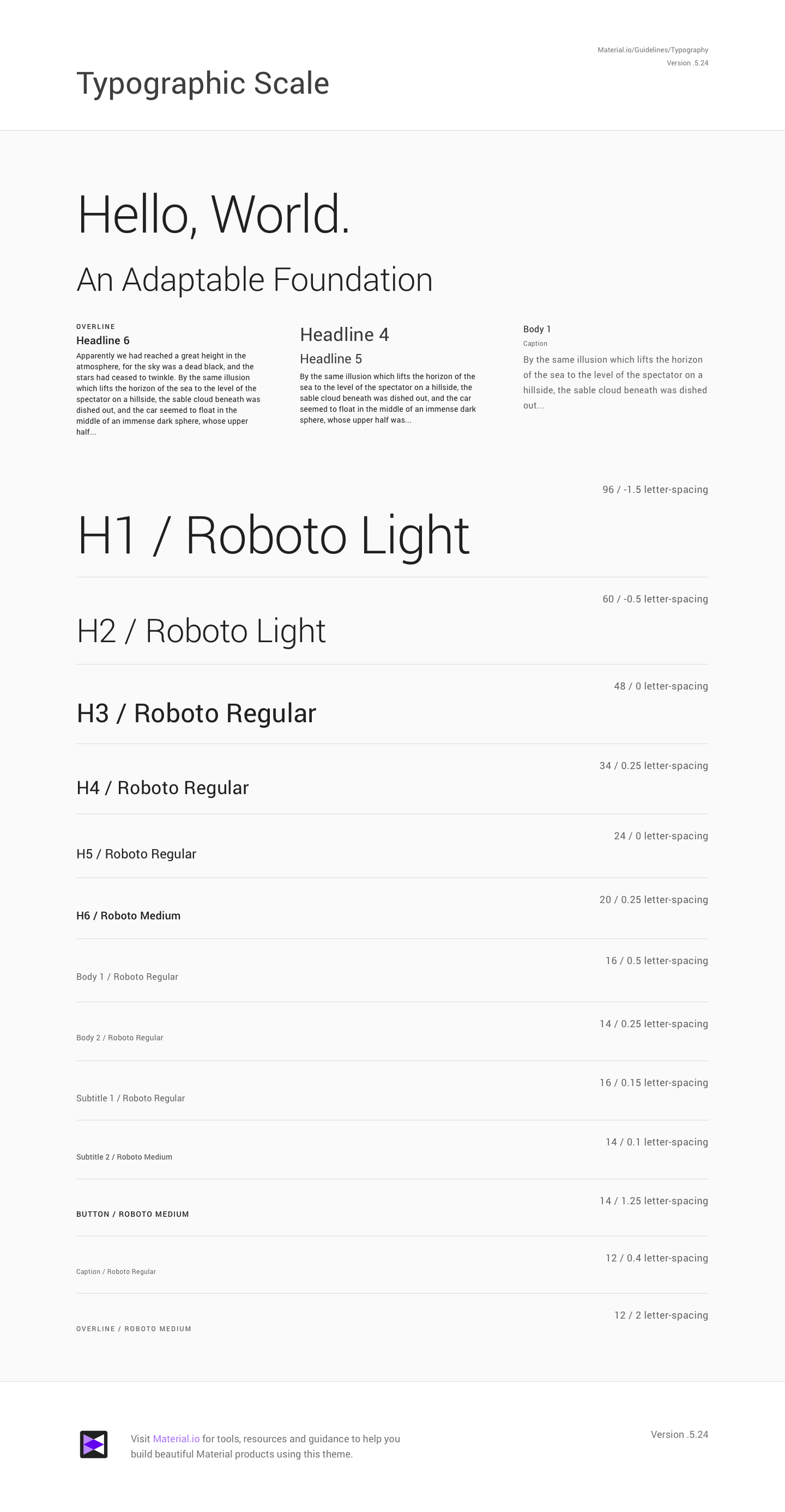
As well as an overall preview of the theme, we get examples of components, color palettes and, most importantly for what we're talking about here, a Typographic Scale:
Annoyingly the designer and dev tooling is pretty disconnected right now so we can't extract the color palette or typographic scale directly as meaningful styles that we can use in Android but it does let us set up values we can then define using the Material Theming attributes for Android.
I think long term we will be able to use the Material Theming attributes as a simpler way for us to iterate on the look and feel of Collect. However, for this post I want to focus just on typographic theming.
Example
Lets run through an example of using the Typographic scale we've generated to style TextViews or Material Components we have in our app.
Here's the home page (Main Menu) as it looks today:
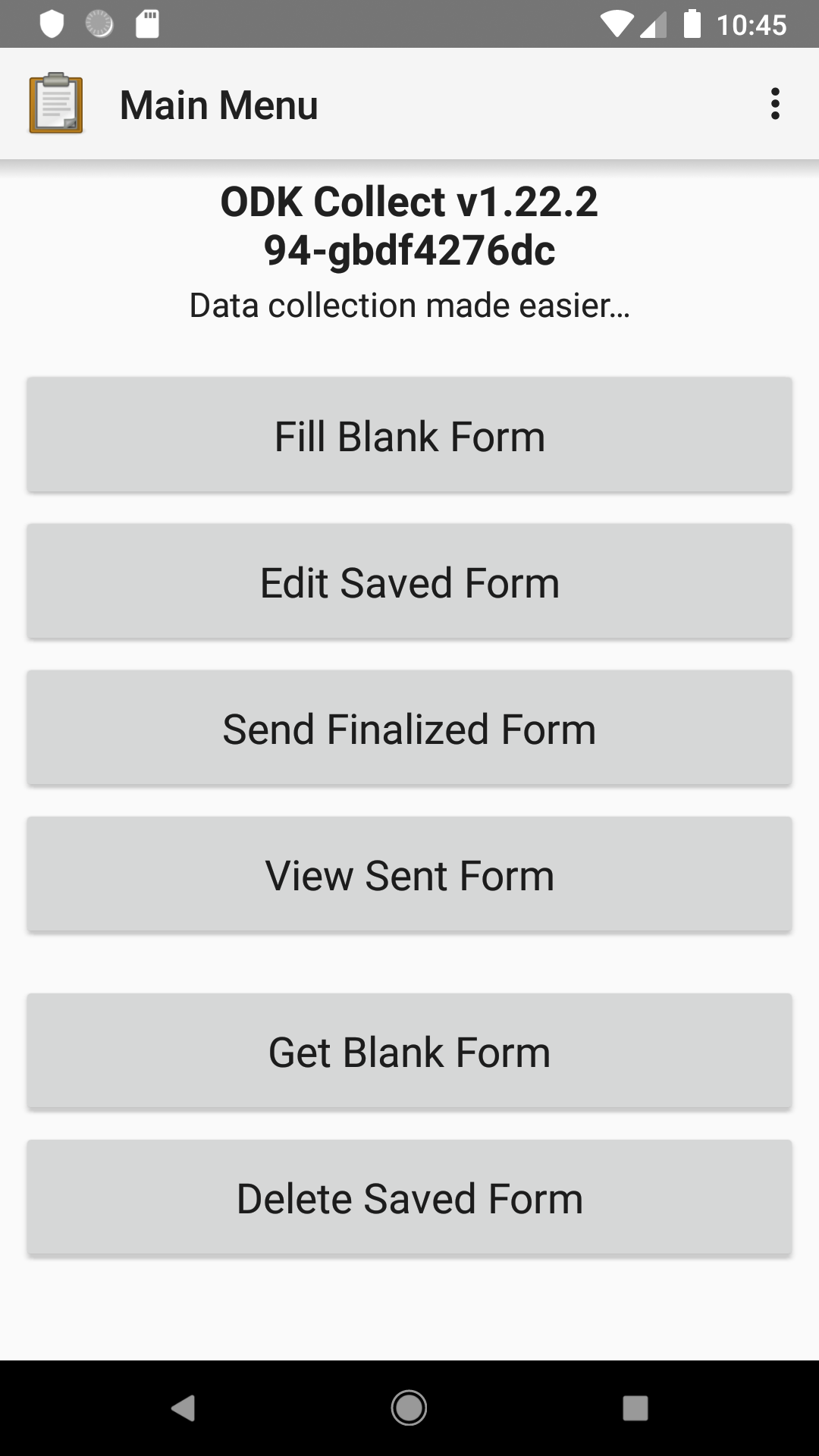
We're just going to focus on the two pieces of text at the top (the title and subtitle). Here's how they are defined:
<TextView
    android:id="@+id/main_menu_header"
    android:layout_width="match_parent"
    android:layout_height="wrap_content"
    android:gravity="center"
    android:paddingBottom="1dp"
    android:paddingTop="6dp"
    android:text="@string/app_name"
    android:textColor="?primaryTextColor"
    android:textSize="21sp"
    android:textStyle="bold"/>

<TextView
    android:layout_width="match_parent"
    android:layout_height="wrap_content"
    android:gravity="center"
    android:paddingBottom="10dp"
    android:paddingTop="1dp"
    android:text="@string/main_menu_details"
    android:textColor="?primaryTextColor"
    android:textSize="17sp"/>
Based on the typographic scale we generated it looks like the two text views are pretty close to "Headline 6" and "Subtitle 1" in style. We're going to go ahead and define text styles for ourselves that inherit from those:
<?xml version="1.0" encoding="utf-8"?>
<resources>
  <style name="TextAppearance.Collect.Headline6" parent="TextAppearance.MaterialComponents.Headline6">

  </style>

  <style name="TextAppearance.Collect.Subtitle1" parent="TextAppearance.MaterialComponents.Subtitle1">

  </style>
</resources>
Defining our own rather than simply using the Material Components styles directly is important because it lets us iterate on those style in the future. Out of interest, here is the definition of Headline6 that we are inheriting from:
<item name="fontFamily">sans-serif-medium</item>
<item name="android:fontFamily">sans-serif-medium</item>
<item name="android:textStyle">bold</item>
<item name="android:textAllCaps">false</item>
<item name="android:textSize">20sp</item>
<item name="android:letterSpacing">0.0125</item>
As you can see it's the same as the style defined in our typographic scale - we haven't deviated from the baseline at all.
We can now use those styles in the TextView items on the home page:
<TextView
    android:id="@+id/main_menu_header"
    android:layout_width="match_parent"
    android:layout_height="wrap_content"
    android:gravity="center"
    android:paddingBottom="1dp"
    android:paddingTop="6dp"
    android:text="@string/app_name"
    style="@style/TextAppearance.Collect.Headline6"/>

<TextView
    android:layout_width="match_parent"
    android:layout_height="wrap_content"
    android:gravity="center"
    android:paddingBottom="10dp"
    android:paddingTop="1dp"
    android:text="@string/main_menu_details"
    style="@style/TextAppearance.Collect.Subtitle1"/>
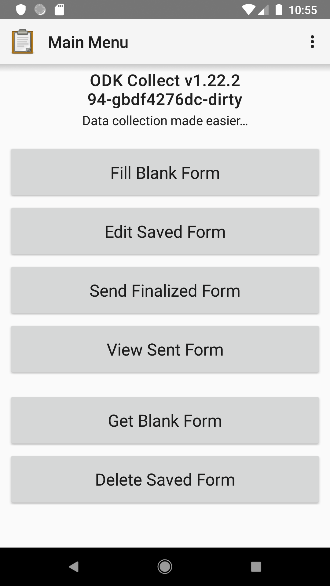
And the home page now looks like this:
Of course we also want to make sure that any Material Components we bring into the app use our text appearance style rather than the baseline one. To achieve this, we define the Material Theming attributes for the corresponding text styles:
<item name="textAppearanceHeadline6">@style/TextAppearance.Collect.Headline6</item>
<item name="textAppearanceSubtitle1">@style/TextAppearance.Collect.Subtitle1</item>
Next steps
My plan is to make changes like this with a 1 PR per 1 screen/widget model so we can discuss decisions around the styles being used for views and also customizations we make to the baseline. I've already got the first one up here. My hope is that after a few screens it should be easy for others to start bringing these styles to screens as well.
In terms of iterating on the theme itself I'd suggest we move forward with a Sketch file we keep on Github (maybe in a separate repo) and share the current generated style guide as a PDF that everyone can access. I've put up a demo of how that could work here.
It would be great to hear everyone's thoughts and questions on these plans!
Next next steps
To finish off, here's some thoughts on the next steps after we're feeling good about typography based on previous discussions with @yanokwa and @LN:
- Review and consolidate iconography across the app to be more consistent and based on the icon colors generated by our Material Theme.
- Review widget spacing and layouts and attempt to make them both more consistent and usable.
- Start looking at shifting the app's theme over to a
MaterialComponentsone - this will mean us fully desiging and adopting a Material theme. For this we can start with something that looks almost identical to the current app but we will then be able to iterate on the theme easily.
EDIT: Add link to demo design repo. Interesting to hear yours thoughts on the approach @cooperka.
 . Thanks for the reminder!