1. What is the general goal of the feature?
Currently, we have a simple button for URL Widget in Collect App. To make more use of material components in the app, I propose that we make use of MaterialCardView to implement this widget.
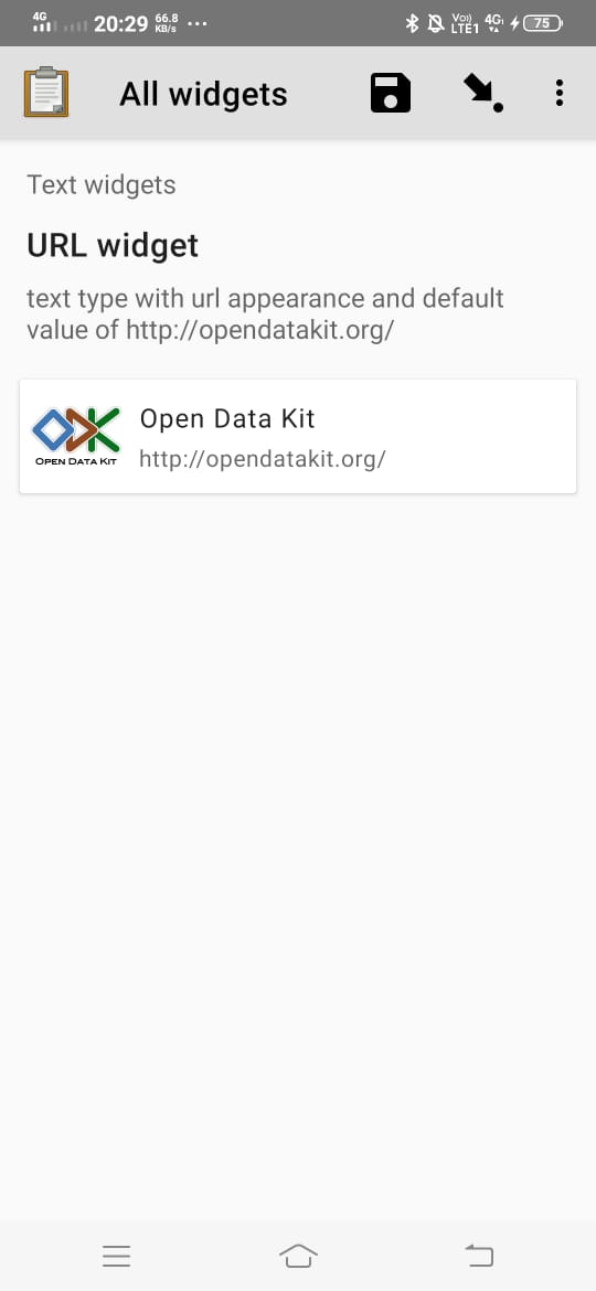
To make the widget look more appealing, we can extract the icon and title of the web page from the URL. In case the URL is not specified, we can make use of default values. We can make use of Goose or any other library to extract the details of the webpage.
This certainly looks a lot nicer. I have concerns though:
As with everything in Collect we can't assume the user will be online so we'd need to think about the default version of this just showing the URL itself and not the title/favicon.
This potentially adds a lot of noise and makes it less clear where the user needs to click? I've been looking around for examples of the URL widget in use to get a better sense of this on the forum but can't find any good ones.
I'd be interested to get the perspective of @yanokwa and @LN here as they might have better contet on how people are using the URL widget.
I agree we will have to fix a default icon, title, and subtitle of the widget, in case the user is not online. We can show material icon image () when the URL icon is not visible and set the title simply as 'Title' maybe.
I was also concerned whether the user will be able to figure out easily that the card has to be clicked to open the URL, as now we don't have a clear message saying Open URL, as there was on the button. I thought about it and maybe we can show a card view with a button. The only concern now is that it might somewhat reduce the clickable area.
Yeah I like the idea of a "placeholder" icon. We could probably just not display a title if we don't have one. I really like the idea of adding "Open URL". We'd probably want it to work like one of the "Supplemental Actions" documented here. I don't think there would be any harm in making the whole card also open the URL on click (i.e. it's "Primary Action"). Then we have the prompt but also the larger click/tap area.
I'd also suggest if we go ahead with this we could do it two parts: rework the layout and have it always work in the default "offline" mode and then enhance it with the online details (favicon and title). I'm not 100% convinced we actually need the second part if I'm being really honest.
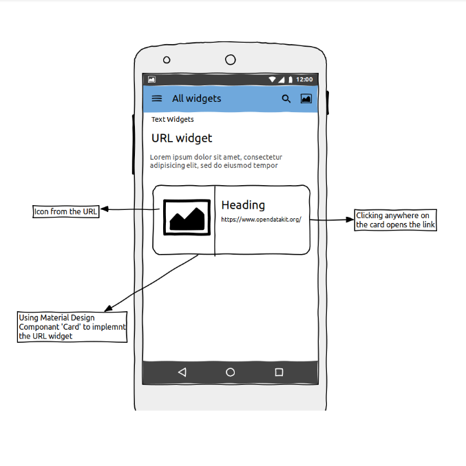
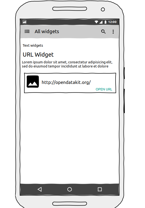
I really like the idea of having Primary and Supplemantal actions for the URL Widget. I was just unsure about the layout. I didn't find any material cards without a title, and it is true that the url string does not look fit to be shown as title on the card. If we are not displaying a default title, then we just have the url and button on bottom right corner, and the UI will look something like this.
Hi Saumia, I'm new here but would love to help from a design perspective! I'm curious to know if the problem you're trying to solve is to make better use of Material Design components, or something else like addressing a navigational problem for users?
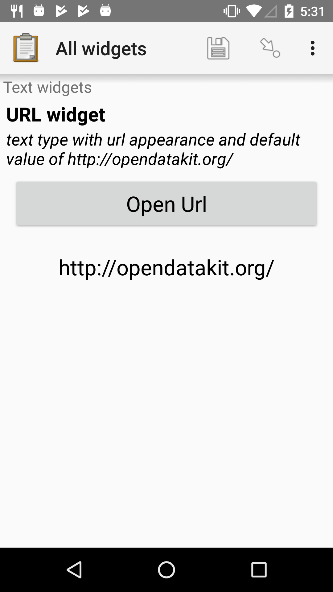
Hi @Aly_Blenkin, Thanks for looking into the problem. The problem that I'm trying to solve is to make the design of Collect widgets more appealing to its users by making better use of Material Design Components. I actually forgot to include in the post, the link to the current UI of the URL widget. You can check it here, if you like. So, I think, the problem is, pretty much just improving the Ui of the widgets.
Hey Saumia, thanks for the context. I agree, it could use some UX love I do think my lack of context might drag things out, but here are my thoughts:
In terms of user data, do you know how well the current URL widget page works now?
What is the user flow before the user lands here, and what happens afterwards?
The description text for the page seems very technical, but perhaps that language works for the user group
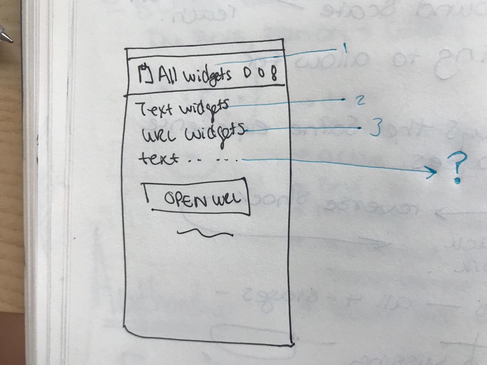
Another thing I'm not clear on is the titles on this page. There are 3 headers that mention 'widgets', but I'm not sure if all of them are necessary and might be confusing (added an image below)
Hi Aly! It is the user's choice whether he/she wants to include the title, or some hint also. So, I think that is not the problem here.
Regarding the workflow of the current URL widget, The URL is treated as an answer for the widget. This answer is not changeable and is pre-decided while creating a form. It appears in the TextBox just below the URL button. When the user clicks on the Open URL button, it opens up the URL in the browser of the user.
What I wanted to suggest, is I want to update on the UI, so that it looks more appealing to the user using Material Card View, without making any changes in the default workflow
Hi Saumia, I completely understand. I was trying to understand the flow so that I could better suggest what the UX/UI and content should be like on this page. I think you're right, the titles are a larger question about the overall information architecture.
Depending on the general screen size, the icon could be helpful (as you've depicted above). I think the icon should be second priority, and the button should be the primary focus. The fact that you're using the material card will also help make the intended interaction more apparent to the user.
From a content perspective, does the user need to see the URL written out? I think you could get away with just having the 'Open URL' on the button. You could also say 'open website' or 'open widget'
I'm also wondering if the description text, under the title, should be in the card as well or is that higher level information? It's hard to tell because it's very technical language.
I'm going to be offline until the end of the week, but I'm happy to jump on a call next week if that's helpful.
I'm going to try and give you some quick context as I know you're newer to this and also don't have an Android device to try Collect out on. The screenshots we're often throwing around are pretty bad for giving you a quick idea of what everything actually is/does. @LN and I were recently chatting about changing the docs and the example form that ends up getting used a lot to have content that more accurately reflects how the widget would be used. There's a trade off of being able to quickly explain to people who are familiar with ODK how what's going on however. Just in case it isn't clear (as it probably isn't) a "widget" is how we generally refer to the views that represent questions in the form. There are docs on all the different question types that form designers might use when building a form here and an example form defined in an XLS here.
In your paper diagram you've called out a few different elements (and conveniently numbered them) that are mostly common to every kind of widget/question, so I can give you an overview of what they represent:
This is the name of the form. @Saumia is using the "All widgets" form here that is used to let form designers and devs play with the different widgets. In the example form I linked to the form name is "WHO COVID-19: Confirmed case report (part 1)".
This is the "group" name. Forms often have groups in the same way that a paper form might have different sections. The linked form has a "Patient information" group for instance.
This would be the question "label". Often ends up being a prompt or a question ("Reporting country" or "How old is patient?"). For the URL Widget I'm actually not sure what kind of content would typically here as I haven't seen examples in the wild. I'd imagine it could be used for linking to training or any policy docs ("Please read T&Cs" for example).
4/?. This is the question "hint". If I was using the example "How old is patient?" this might be some text to prevent an enumerator (data collector) entering invalid data - "Enter a whole number between 0 and 200" for example.
Thanks so much for the additional context, Callum! That's super helpful! I think changing the docs and the example form that reflects how the widget can be used would be a great resource. Perhaps I've missed it, but do you also have a digram that shows the end-to-end journey? This might be a helpful artefact for designers to contribute in a more meaningful way.
No that's missing. I know there is work ongoing to put together a more user-friendly "how it works" overview for the website (https://getodk.org) as it's something we really need.
This is a great question. @Saumia what do you think about removing the URL from the widget? Then maybe just having the button is the way to go?
@seadowg I thought about this. This is a really good suggestion. Thanks, @Aly_Blenkin. We can have Visit Website or Open Website. Removing URL seems like a good option.
That'd probably be nice to put as a PR! I'm not sure about the copy... could be "Visit" or "Open" or probably something else but that's easy to change/discuss.
As we discussed, I should just focus on the first part now, just the Material Card View for the URL, not to extract the header title and icon of the webpage.
I'm not sure it makes sense to have a card if we're not going to have the URL or header/title. Maybe for the moment we should just stick with the button but remove the URL?
 ) when the URL icon is not visible and set the title simply as 'Title' maybe.
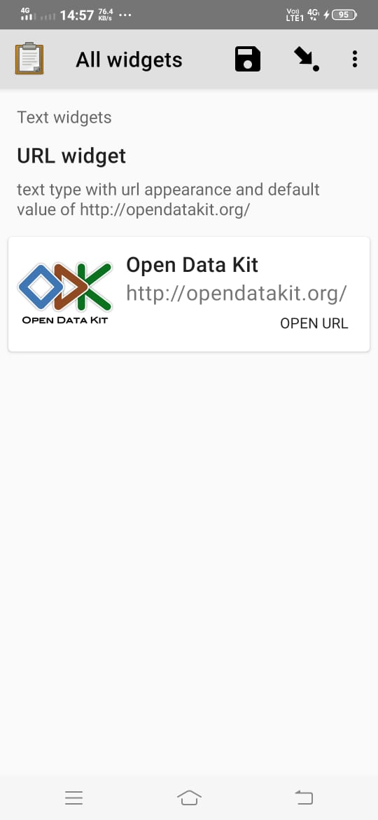