Radio and checkboxes in Browsers are a strange relict of the last millenium. In case you have tried to change their look on normal web pages, you know the dirty tricks required to get this to work - shifting the boxes off-screen is the funniest part. I have tried this for formio, an Angular based framework here.
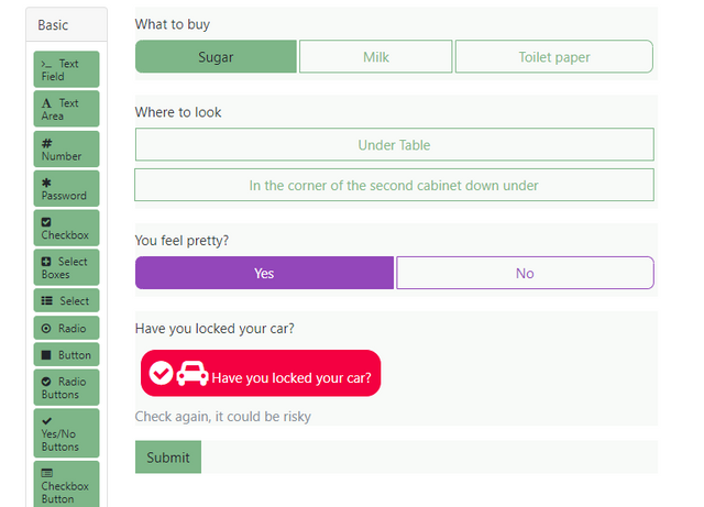
On mobile devices, checkboxes are much too small and when selected. RedCap - data entry for medical studies - has a solution that works nicely
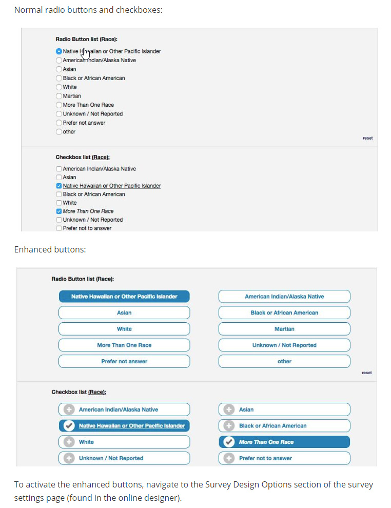
List items in Android are selectable by tapping anywhere on the element. That is, you can tap on the radio button/check box but also on the text or in the margin above or next to the element. We've also extended that tap area all the way to the horizontal edges of the screen instead of leaving the usual margin because users often answer questions while holding their device in one hand. We've also recently tuned the vertical spacing between select elements based on user observation and feedback. Is your concern that the larger tap area is not discoverable so users may try to keep aiming for the radio button or check box?
It does not help to know it theoretically, user want intuitive behaviour. And it is intuitive to try to hit the square. I know that everything can be touched, and nevertheless try to hit the square, because there I get the immediate feedback.
I have asked users about your orange-border solution, but they were not happy with it. I do not know exactly why, but to me the border it looks like the active (not the selected) button in Windows.
Partly. We have made some studies when using RedCap as an eCRF (electronic case report form), where you can select between the two. The colored buttons were strongly preferred, even by young trained users, but the more when patients filled the form. Being able to hit correctly was not the primary argument (even if Fit's Law would suggest it), the main advantage is that even out-of-focus it is easy to see that an item has been checked.