New design updates ![]()
We have implemented the following changes based on your feedback!
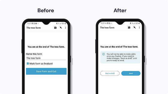
Finalizing your form
There is no longer a checkbox to “mark as finalized” on the last screen because it caused a lot of confusion for people. Now, the data collector will see a message to tell them what to expect next, and the buttons will change based on the form settings. For example, if the supervisor has turned on save as draft and auto-send in the settings, the data collector will see “Save as draft” and “Send” buttons. By default, “Save as draft” and “Finalize” are shown.
We also removed the ability to manually write the instance name.
Form design tip![]() If it’s really important for your workflow that data collectors first save a draft, you can add a question that prevents premature finalization. For example, you could add a checkbox at the end of the form that says "Has this gone through full review" yes/no with a constraint that yes must be selected. If the data collector selects no, they won't be able to finalize. You can tailor the message to your context. For example: "Give your phone to Zenia so they can review your answers. When they are done, Zenia will type their name below" (text question that has a constraint that it must have value "Zenia").
If it’s really important for your workflow that data collectors first save a draft, you can add a question that prevents premature finalization. For example, you could add a checkbox at the end of the form that says "Has this gone through full review" yes/no with a constraint that yes must be selected. If the data collector selects no, they won't be able to finalize. You can tailor the message to your context. For example: "Give your phone to Zenia so they can review your answers. When they are done, Zenia will type their name below" (text question that has a constraint that it must have value "Zenia").
Main menu
We have improved the main menu! We have changed the language to make it easier to navigate, added icons, and enhanced the buttons ![]()
Coming soon ![]()
- App feedback: We are creating more actionable feedback messages throughout the finalization flow. These messages will be shown at the bottom of the screen in a black bar to let users know what’s happening based on their action on the last screen.
- Exit modal: We know the exit modal is confusing. Users will soon see an improved modal that makes it easier to take action.
- Summary view: We are investigating adding a summary screen showing what’s completed and if there is any missing information to be reviewed before sending to reduce errors. We want to do some performance testing before we decide to implement.
- Jump to another instance: We were debating giving the user the ability to jump to another instance of the same form when they are done or go back to the main menu to create a smoother workflow, but we need to do more testing.
Want to test these new features? Join the beta program
User feedback was key to making these design improvements
Let us know what you think!

