What high-level problem are you trying to solve?
Fit more form content on screen and reduce scrolling up & down. Currently the image fills the entire screen width, so an unanswered image question in landscape on a handset takes up the entire screen and once answered it takes up multiples of the screen height, and an answered image question in portrait on a handset takes up the entire screen or more. A portrait image on a landscape handset is the worst, with the question taking up >400% screen height.
On a larger screen tablet, the buttons in the unanswered state fit well, but once answered, again the question takes up from ~75% of the screen height (tablet in portrait, landscape image captured) to >300% of the screen height (tablet in landscape, portrait image captured), which leads to a lot of scrolling to get past the image preview, especially if there are multiple image questions in a field-list
As it is only a preview and it must be opened to annotate, there is no need for it to be shown so large, only large enough to recognise the content / confirm adequate sharpness. (without annotate appearance, tap to view only would allow a full screen preview)
Any ideas on how ODK could help you solve it?
Modified layout of buttons and image preview as per mockups below. Subject to required screen space for button translations and RtL / LtR languages!
Upload any helpful links, sketches, and videos.
Currently, portrait / landscape takes up the entire screen, even on larger tablets, requiring more scrolling up/down.

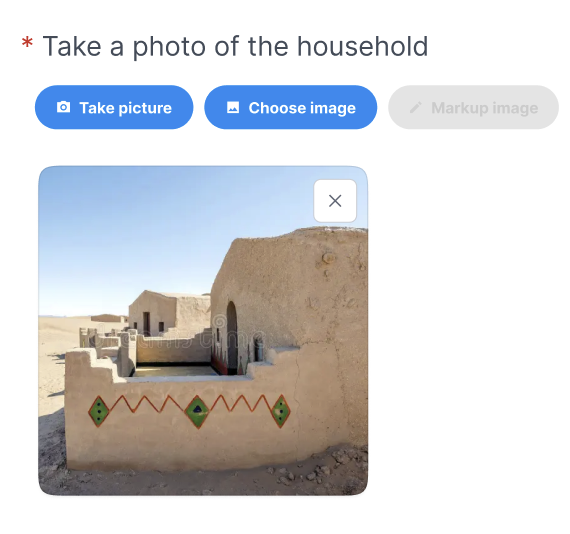
mockups of alternates;
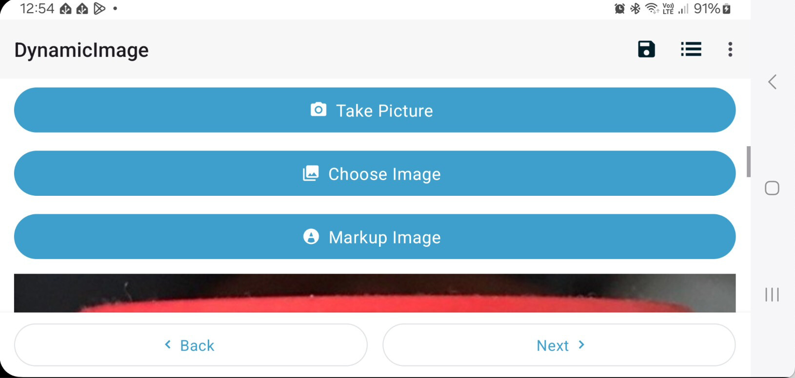
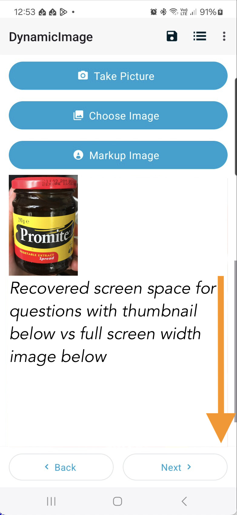
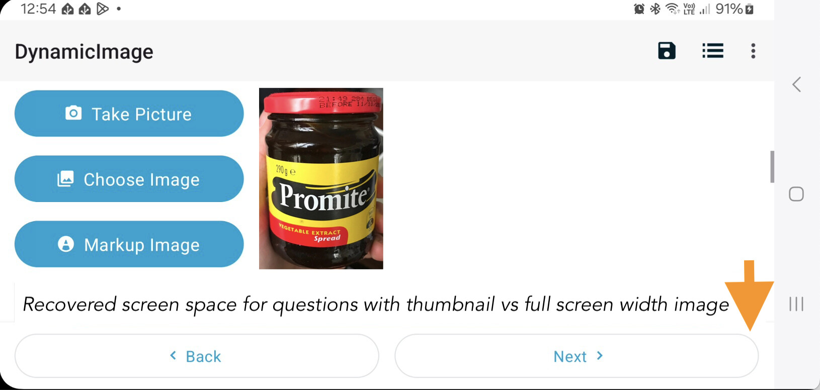
Keep the image below the buttons but make it a fixed % of screen width or user set width or height parameter in % or pixels. This works well in portrait and has less of a benefit in landscape as the buttons take up much of the screen by themselves.
Move the image inline with the buttons and let it take up as much of the available width / height as it can, aspect ratio depending. Again, a lesser benefit in landscape, but some is still achieved on a handset, and much moreso in larger & 'squarer' tablet screens (Can currently only fit 1x unanswered image question onscreen on a 6" handset in landscape but can currently fit 2x unanswered image questions, plus a few lines, on a 12" tablet in landscape)
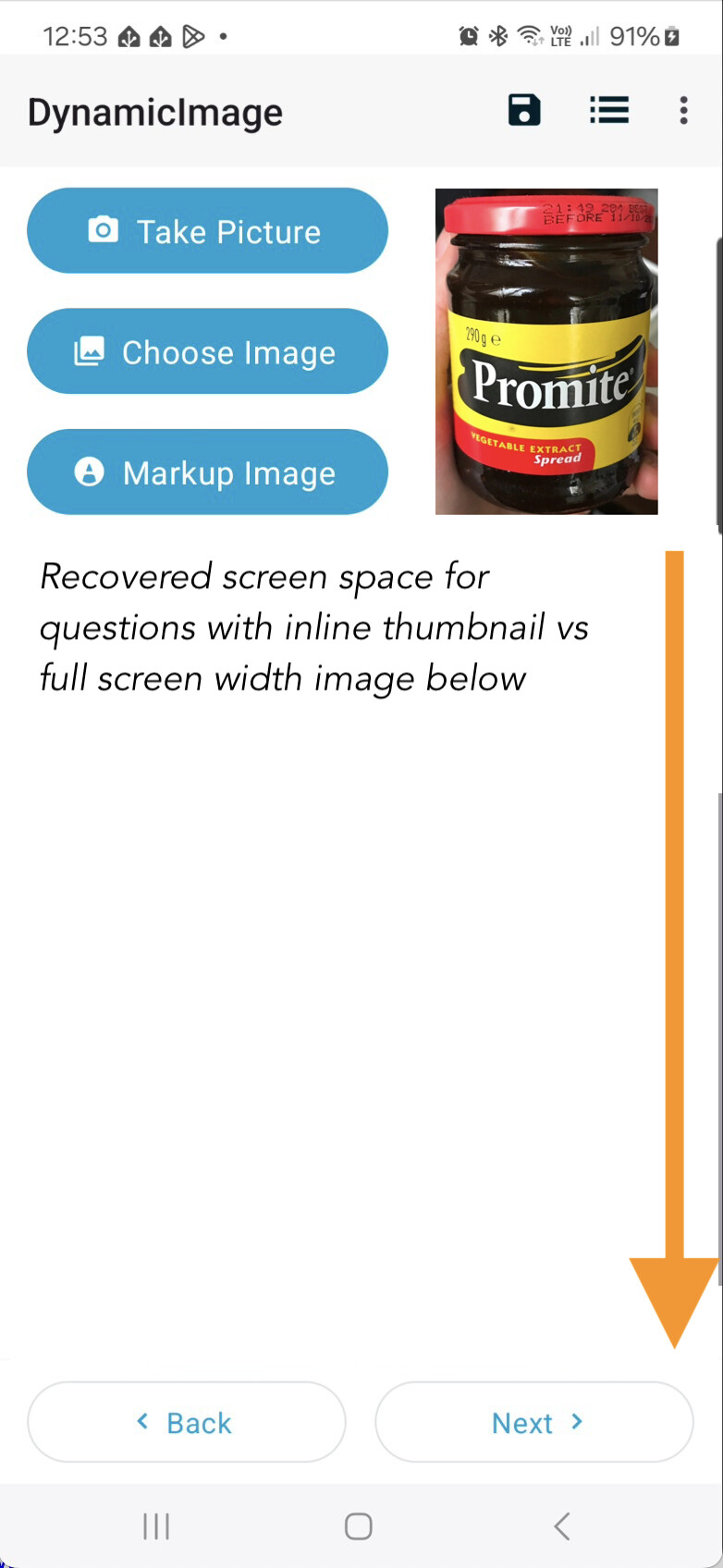
Inline could allow 2-4x image questions visible at once, screen size and orientation dependent (~4x in portrait on a 12" tablet)


 , as it’s related to other themes we are working on like