What is the general goal of the feature?
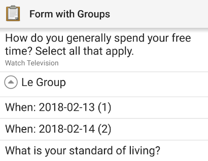
Currently in the jump screen when there is a repeat group with filled out items, we see things like this (imagine two items in the repeat group with dates Feb 13 and 14):
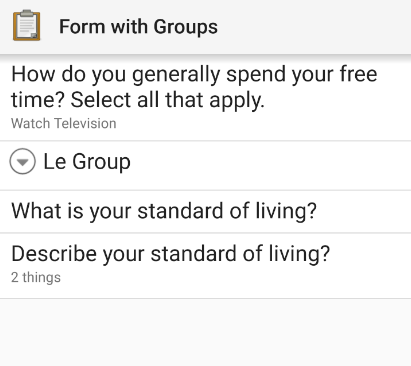
To me the expand arrow seems like an odd interaction technique for a mobile UI.
Typically on mobile when you are browsing a hierarchy (think Android settings screen or Google Drive app), tapping an item with children opens a new screen with the children. That is even the case in ODK sometimes. Once you tap one of the repeat items, then you go to a separate screen. So there is a strange mix.
I propose we right this wrong by doing away with the expandy arrow and making a new screen open when you tap the repeat group name.
One drawback to this would be you'd lose the visual cue indicating that "Le Group" is a repeat group. But I think there are better ways to convey this, like having icons for all rows in the jump screen (questions and groups).
These and other ideas are captured in these wireframes: https://app.moqups.com/sassafras/4WPu8QH3er/view/page/a9e9f72cf, but the focus of this post is just the separate screen bit.
I don't think there would be a big training hit if we did this. Folks would still see the name of the group, tap it, and then see a list of items, tap them, and so on. We could perhaps have a legacy mode just in case, not sure what the community would feel comfortable with.
But in general I think we need to keep moving toward compliance with Android UI conventions and this would be a big step in that direction.
Thoughts?
What are some example use cases for this feature?
Using repeats and wanting to jump around a bunch.
What can you contribute to making this feature a reality?
Quite a bit if we can agree on it!