1. What is the issue? Please be detailed.
Is it possible to set marker color to a selected point?
2. What steps can we take to reproduce this issue?
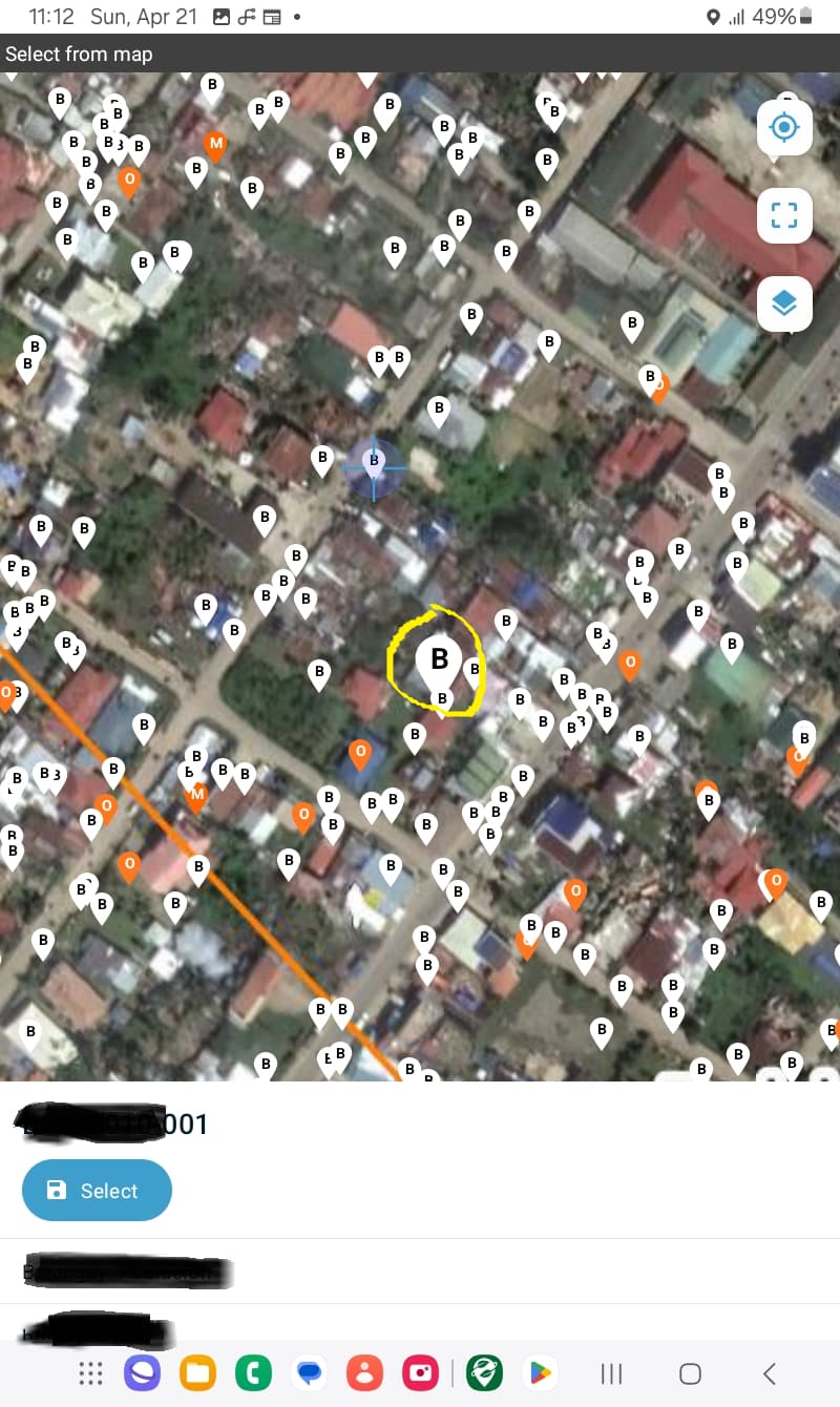
A select question precedes the select from map page. The select question allows the data collector to select a structure number that was previously generated and assigned to a structure (with lat long). These pieces of information are preloaded to this second form. After selecting a structure code, the map shows the (a little bigger) selected point together with the other preloaded points (to allow the data collector to plan his/her route). However, sometimes it's hard to find the selected point from among the other points because they have the same color.
3. What have you tried to fix the issue?
i have not tried anything yet. I could not find from the documentation any information about setting marker color for selected points.
4. Upload any forms or screenshots you can share publicly below.
Please see attached photo.
You need to use the marker-color and marker-symbol properties to style geopoints
Edit: apologies, i misread, that is for default styling, the selected point enlarges when selected but doesn't change color
Have you tried applying a choice filter after the first select to remove the other choices and only show the selected item or selected and some other subset of points?
Alternately, is there another system that you think does a better job of highlighting the selected point? I notice that Google Maps always makes the selected marker red, we could consider something like that.
To elaborate slightly, if you stored other fields against your locations (suburb / town / street name / grid ID) you could choice filter to those that matched or were adjacent, or if you had lat / long values as individual fields, you could filter down to those where selected lat / long was +/- 0.01 degrees which is ~ +/- 1.1km. There are other geofencing examples on the forum that may help you filter also.
Unless the points are already styled red! (I am currently styling in many colours to indicate different categories/priorities.) Could selecting a point instead make the others monochrome / semi-transparent / hidden, then deselecting a point returns all to initial styling? Or as well as enlarging, also change from a map pin icon to a different kind of icon. There are similar issues with selected traces/polys, which are currently very hard to discern the selected item, especially when you (me!) have many overlapping ones.
This is definitely a UI problem, I'm sure @Aly_Blenkin will have more and better ideas than these.
A higher zoom level when you use the GPS on a "select from map" would help. We can consider that if the GPS is used to select a place, we will probably want to select a place very close to the location, or at least most of the time. For the moment the default zoom level needs the user to zoom in a lot before selecting the feature.
A filter based on distance would also help a lot :
I have a configuration that uses a geopoint to select the item (as I can't style polygons yet), then that loads the geoshape into a following question.
When opening that question, the zoom is such that it takes up ~50% of the map horizontal / vertical length (i.e. 6cm wide on screen with 12cm map width), but once the polygon is smaller than ~5m across, it doesn't zoom any further to keep it taking up ~50% of the screen x-y, but the user can zoom closer.
Thank you for your response. That was my original design, applying filter to see only the point selected. However, the data collectors would want to see the other points in the area so they can plan their route. As @mathieubossaert mentioned, a higher zoom level would help.
Great ideas! We will add it to the design backlog and generate a few options for improving how we highlight the selected point. I like the idea of unselected points fading to the background so the contrast between the selected point is more clear.
We also have noted improving the zoom behaviour and want to investigate this. It could be as simple as remember the last zoom level preference.
Would also like to add, although I know it would be better to create a different post, but it is sort of related to this. I hope it would be possible in the future to label the points with unique IDs instead of just a single character.