Refinements to Repeat Group Navigation

What is the general goal of the feature?

Many form designs include repeat groups that may not be filled out in a linear fashion. For such forms, the ability to easily jump from repeat item to repeat item would be a big usability gain. We are wondering if a sidebar may be a useful tool for this.

What are some example use cases for this feature?

Imagine a form for a household with 10 members. The enumerator wishes to first list everyone's name, and then survey the members one by one, often jumping around the list in a non-linear way. Getting the names at the beginning is important because people may come and go.

Currently, doing this via the jump screen is somewhat painful.

Now that we have the ability to dynamically name repeat items things are somewhat better, but still, if you are on a question in one of the repeat items, to go to a different item, you need to tap: Jump > Go Up > Expand Arrow > Desired Item > Desired Question. That's 5 taps for each jump! If you're doing this a lot, that's a lot!

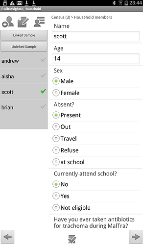
The Carter Center previously developed a custom app that had a sidebar for this purpose. See the screenshot below:

They are now moving to ODK but are missing the ability to jump around repeats easily.

Some notes on relevant functionality from the screenshot:

  • The questions in each item are displayed like ODKs field-list style, and tapping an item in the sidebar brings you to the top of the questions.
  • There is a button to easily add a new repeat. ODK is missing this presently.

What can you contribute to making this feature a reality?

At first, just by talking to folks and figuring out what works for the community! Development contribution is also a possibility once we figure out a way forward.
Fundamentally, I think making nested data easier to work with is really important. I see a number of goals:

  • user can quickly see a list of existing nested record
  • user can quickly jump to a specific nested record
  • user can quickly add a nested record
  • user can use nested records comfortably on any device form factor

I'm using the term "nested record" because while repeats are the current way to handle this, Linking different forms could be an alternative.

A sidebar could be a good solution for devices with large screens but I think it would be problematic on smaller devices. @tomsmyth, do you know who built the Collect fork with the sidebar that you shared a screenshot of? Is it open source? It would be interesting to be able to try it on different device form factors and see how that challenge is addressed.

An alternative might be using a whole screen for the beginning of a repeat showing a list of existing records and a + button for adding a new one. The user could either tap an existing record to edit it or the + to add one.


Something line this screen could replace the dialog box currently used to add repeats.

Your other proposal at Separate screen in jump screen for listing repeat items could also potentially address the issue. For example, the jump screen could be changed so that if a repeat only contains a field-list, tapping the jump menu goes to the summary of all records rather than into the specific record the user is in. Perhaps a button to add repeats could be included there.


Similar concept as above but accessed through the jump menu.

All this to say that there are a few ways to address the core problem. @tomsmyth do you see the sidebar as a must? Do any of these other approaches resonate with anyone? Any others that should be considered?

1 Like

Seeing a screen before the beginning of a repeat (and maybe even the end) of the repeat would be my preferred approach. I think it's important to have it inline because repeats are confusing and burying such an important UI improvement behind jump doesn't feel great to me. Agreed that it's a big change, but we can have a long beta or use a feature flag for a few months.

This is super interesting. I have some thoughts but they're not complete yet. Give me a day or two to finish them and get them in.

Once quick thing:

Your other proposal at Separate screen in jump screen for listing repeat items could also potentially address the issue. For example, the jump screen could be changed so that if a repeat only contains a field-list, tapping the jump menu goes to the summary of all records rather than into the specific record the user is in. Perhaps a button to add repeats could be included there.

Yes!! This exact thing is waiting in our Redmine repo to be "proposed" over here. Just didn't want to inundate with too much stuff at once! Great minds!

And likewise, if you tap an item in the said list, it could skip the jump screen detail view for that item and go directly back into the question view. So then to go from one repeat to another is just two taps instead of 5 or 6.

More soon...

1 Like

do you know who built the Collect fork with the sidebar that you shared a screenshot of? Is it open source?

A now-disbanded group, and no it is not open source. In fact I don't think the source is even still available full stop. (So I guess that makes it "no-source".) Anyway it's a dead project. Just trying to capture some of it's better features into ODK.

An alternative might be using a whole screen for the beginning of a repeat showing a list of existing records and a + button for adding a new one. The user could either tap an existing record to edit it or the + to add one.

This is interesting but I don't quite get how it would work. So you're filling in questions and then you swipe and this new screen comes into view, then you add some items and then i) swipe again (starting the first item) or perhaps ii) tap an item to jump into it?

While I agree with Yaw it would be nice to have this front and centre, I worry that this would kind of break apart the main metaphor of the application right now, which is that the questions are laid out left to right in space and you are moving through them by swiping.

When you go to the jump area, that's like a different area of the app. I visualize it as stepping up or back and out of the main flow. To insert a navigational element into the flow itself would mess with this visualization.

Also, how would you easily get back to the repeat nav screen once you are say 20 questions into a 40 question repeat? You could use the jump screen I guess? But that seems really odd.

For example, the jump screen could be changed so that if a repeat only contains a field-list, tapping the jump menu goes to the summary of all records rather than into the specific record the user is in.

YES. As I mentioned above, I actually had this idea as a separate thing to post to the features forum later. I would also add the reverse—in the jump screen, if you tap on a repeat that is a field-list, it jumps you right into the question view. So then going from one repeat item to another is only 2 taps, which seems pretty reasonable.

Perhaps a button to add repeats could be included there.

Absolutely. And also buttons for deleting existing repeats. This was in my mockups of yesteryear.

do you see the sidebar as a must

I would say that doing the above seems much easier and would be super useful for us and for the community whether or not a sidebar ever comes to pass. I could imagine having someday having a sidebar that only appears on devices over a certain screen size, and that looks much like certain parts of the jump screen, but I think it would be best to start from the above simpler ideas. So to recap:

  1. Separate screen in jump screen for listing repeat items
  2. Skipping repeat item screen in jump screen for field-list repeat items (both directions)
  3. "Add item" button in jump screen for repeat group
  4. “Delete item” buttons in jump screen for repeat group

I guess the next step here would be for me to write a specification for the above in the Roadmap repo and get it on the TSC agenda?

Does Nafundi have capacity to work on this stuff or should we plan on finding our own?

Thanks for all the thoughtfulness on this you all!

1 Like

This sounds great to me and I like that the different components can be addressed incrementally.

@Shobhit_Agarwal actually had a fairly complete implementation for the first part almost a year ago now (!): https://github.com/opendatakit/collect/pull/1271. This is a big enough change that I don't feel comfortable moving forward with it until there's at least another pair of eyes on both the high-level concept and the code. It sounds like there's more interest in this now an we do have lots of new awesome contributors so hopefully we can get those eyes.

I do think it would be great to get a quick writeup summarizing all the different ideas in front of the TSC -- that will at least guarantee some of those eyes and make sure we're all back on the same page.

household members.pdf (267.0 KB)
Thinking about smaller screen interaction.

1 Like

Thanks Dottie. I will try to incorporate that into the proposal I've promised here..

1 Like

OK, proposal created: https://github.com/opendatakit/roadmap/issues/19

It differs a little from what we discussed here because I had a kind of epiphany as I was writing it up, but let's continue discussion over there...?

Thanks to @LN I found this thread - it didn't come up when I searched or during my composition... So apologies for duplication:

There's definitely a lot of overlap here - clearly more thought put in by @tomsmyth :slight_smile: but I still think that the 'add new group' button might be a useful replacement to 'got to end' (no space for additional button). That is kind of covered in the discussion but is part of an additional jump screen. I guess I like the simplicity of one layout, rather than different jump screens depending on where you are in the form...

One thought that struck me is the use of a 'fly-out' side bar to navigate between groups, that I've seen in other apps but for different purposes (e.g. Qfield) - that might get round the lack of space on most phone screens, but may not be viable within the current functionality of ODK Collect?

I agree with @yanokwa that an inline dialogue would be helpful - I am currently implementing a note as the last 'question' so that my users can find the place to navigate their way to a new group when using the jump screen... But the direct 'add new' would give the addition navigational option... Does that give a 'best of both' approach?

A note of caution, prompted by my duplication:

It gets more difficult to keep up if discussions leap from platform to platform... This isn't my day job, so I have limited time to keep track of stuff - and I'm easily confused. Would appreciate any proposals or updates coming back to the forum, but accept that there could be nitty-gritty discussions at the 'development' level. No offence intended.

Thanks.

Hi @seewhy! Glad to hear others are thinking about changes to the repeat navigation stuff!

'add new group' button might be a useful replacement to 'got to end'

I can see the logic in that people may use 'Add' more than 'Go to end' in that situation, but I worry about mixing two different types of action in that bar. Right now it's all about navigation (which doesn't change the data in the form at all), but you're proposing to change it so one of the three adds data instead. I worry about the reduction in consistency there.

Given that my proposal does include an 'add group' button, I wonder if that would be enough? I think/hope you'll find the change in the jump screen structure pretty natural...

I like the simplicity of one layout, rather than different jump screens depending on where you are in the form

Note there are already different jump screens in the app—there are a combination of different jump screens and nested list items, which is quite unorthodox. Typically on mobile, navigating a tree structure is done by changing screens. At least in my experience. And I believe it says this in the Material Design guidelines.

a 'fly-out' side bar to navigate between groups

This is an intriguing idea and I would say it's not incompatible with what we're doing in this proposal. The latter is a smaller change to the existing jump screen, which I think we'd have to preserve anyway given how many people have been trained on it. A flyout sidebar could be explored as well as a coexisting alternative perhaps.

I agree with @yanokwa that an inline dialogue would be helpful - I am currently implementing a note as the last 'question' so that my users can find the place to navigate their way to a new group when using the jump screen... But the direct 'add new' would give the addition navigational option... Does that give a 'best of both' approach?

I'm a bit confused about this one. There is already a modal dialog that appears at the end of an item prompting you to add another one, right? @yankowa was proposing not to add a dialog but a full screen that appears and includes a list of existing items and the ability to add new ones, etc. Is that what you're referring to? I wrote some questions/concerns about that approach above. Do you have any thoughts on those?

It gets more difficult to keep up if discussions leap from platform to platform...

I hear you. I think proposals live as issues in Github so they can be included in the Roadmap project. However, the issues could just consist of links into the forum...

1 Like

Adding in here that I am a fan of @LN suggestion around a screen pre-repeat showing existing records and a + symbol or similar for more.
I think the pop-up box currently is not great from a GUI perspective (comes across as slightly jarring) so I am in principle in favour of a cleaner interface for starting nested groups and certainly the ability to jump back inside them from a main screen would be highly valuable

Hi @tomsmyth
Sorry didn't see the continuation of the discussion...

Fair point about the potential for confusion if 'add new' can change the data - but then your suggestion changes the function of the header too. It would be a great improvement on the current situation, so if that's the preferred implementation I'm happy.

I'm a bit confused about this one. There is already a modal dialog that appears at the end of an item prompting you to add another one, right?

This is my current work-around rather than a proposal - at present when you're in a jump screen I think you need to know that you have to select the last question in the group, then navigate forwards in order to get the modal to pop-up... and counter-intuitively (in my mind) 'go to end' actually means go to the end of the whole form, not the end of the repeat group - that creates a problem for me as my nested repeats are in the 'middle' of the 'top level' form (because the last few questions are essentially an opportunity for an overview / review) so those questions are easily missed by a 'skipper'. Sorry I digress.

So I used a read-only (note) question that says 'end of section - tap here to add a new one' - so that people can see, from the jump screen, how to add a new section [group] in my form and the 'hint' text tells them how to do it if they have arrived in a linear way. Maybe if @yanokwa 's inline idea is the way forward (to top and tail the repeat) it could be shown as 'add new [group]' at the end of the jump screen list. I may have caused confusion by calling it a dialogue and you interpreted it as a modal? Would it work for linear navigators to arrive at your proposed layout when they start the first repeat group (i.e. an inline screen) and 'return' to it at the end of the repeat, by default, and they can also get there by your proposed method? So the two ideas merge seamlessly to provide the same enhanced functionality.

Hope this helps