Visual display of groups in Collect

When experimenting with groups and how they behave in Collect I did not notice any difference in display than if they were not grouped. I would have expected some sort of visual delineation at a minimum, and at best some sort of expandable/collapsible button for the group similar to how repeats are displayed. Is there any possibility of including something like this? Or maybe I am not including something required in my xlsform.

What is the general goal of the feature?
-Visually alert the user to a group of questions grouped by the begin group/end group XLS type standard.

What are some example use cases for this feature?
-A form designer might want to group logical subsets of data. This quickly orients the data collector to sections of data they may or may not want to fill out. Ex: Stream survey form -- might have wood category with multiple parts and substrate category with multiple parts.

What can you contribute to making this feature a reality?
-I am a developer and could potentially start working on a prototype and request a merge or however that works.

Hello,
From what it sounds like, you are not using the appearance setting "field-list" on the group. Using this displays all the questions on the same screen. Is that the sort of thing you were after? You might want to investigate "table-list" as well

1 Like

You are right. I thought I tried that but upon trying it again just now it worked but not exactly how I was expecting. I guess I need to do some more experimenting with form design.

I'm wondering if there is a way to have a label for a group then upon selection get the list of fields for the group. Currently with just using "field-list" it still shows all the fields in the parent form, it would be cool if I could hide them in the parent form.

To hide or show groups, you need to set a value in the "relevant" column of the survey form.

Thanks for bringing this up, @fkaye. I think there's certainly improvements to be made in this area.

First, I want to draw your attention to some tangentially related ongoing work on improving the display of repeat groups: Separate screen in jump screen for listing repeat items, Refinements to Repeat Group Navigation. The current plan is to start with the specification at https://github.com/opendatakit/roadmap/issues/19.

Non-repeat groups could potentially be collapsed in similar ways. Most of the changes proposed so far have been for the jump screen/hierarchy view. It would be helpful to get a very rough idea of how you would like groupings to be identified. A paper-and-pencil sketch with some ideas would be great.

When I've given this some thought, the big challenge I've run into is that form developers use groups in pretty different ways. In fact, I do this myself. Sometimes I use groups simply to bring structure to my XLSForm. I often omit a label for those groups but sometimes I include one. Other times, I create groups with labels and they're important for giving enumerators visual cues on where they are through the breadcrumb at the top of the screen. So if we do come up with a great way to indicate groupings, we may want to make it configurable by the form designer.

I see the complexities there @LN . Definitely some careful execution is needed to make it beneficial for all as you pointed out there are many ways groups are used in form design.

I will try to come up with ideas or proposals as I think this could be nice improvement.

1 Like

Thanks for the reply's @Paul_Storry, The problem with this is that the relevant attributed carries across in parent form to child group page if using "field-list". Unless there is some way to handle this?

Goal would be to show group label & hide group fields (while in parent form) then upon entering the group page (due to 'field-list appearance)' by selecting the group label it would show group fields.

1 Like

Looking forward to what you come up with, @fkaye.

I played around with @Paul_Storry's concept a bit and came up with a somewhat wacky way to get close to the workflow I think you want: collapse-groups. You'd navigate this by selecting a section you want to fill out, filling it out, swiping back, selecting another section, etc. The select one acts as a kind of table of contents. Then, at the end, you can pick which block to actually save. Presumably, there'd be a bunch of questions between the table of contents and the final select. Like I said, it's wacky and I wouldn't recommend it but maybe it gives interesting ideas.

This also connects to questions of form linking (Linking different forms) and non-linear navigation through the form. One possible approach would be to make it possible to create links to any specific question in a form.

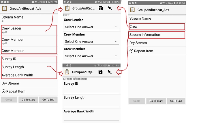
So I just mocked up a quick little image of what I am trying to accomplish. The Left frame is the parent form and the center frames are the groups set as 'field-list'. What I'd like to be able to accomplish is something more like the right frame--No visible group questions in parent form, just display group label. Then group label would display all group questions. As you can see a pretty simple implementation but I couldn't find a way to accomplish this.

The right frame to center workflow is an example only I was not able to get that workflow to work, but is something that I think would be a beneficial enhancement.

I thought I might share some of the design I've done in iXForms, since this is how I approached the whole issue of displaying a (fundamentally hierarchical) XForm. In Collect, you essentially swipe linearly thru pages of the form - typically one question per 'page', or at most a few adjacent questions grouped together onto the same page using a field-list. Instead, by default, I display the entire form as a single page (!), in which you scroll up or down freely over all the questions. Before addressing groups specifically, let me describe this in a bit more detail...

A Page

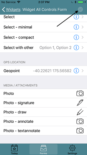
Because all the questions are shown on the same smoothly scrolling page, as much as possible I therefore try to keep their respective control widgets compact so that they can display and operate 'inline'. This minimizes the visual jarring that occurs when constantly flipping between screens. For example, I maximize the use of inline selectors (iOS UISegmentedControls) for select-ones, to which I've ascribe the 'minimal' appearance tag. Single line text, number and decimal controls can likewise be naturally displayed inline.

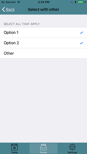
[Aside: I'd like to do likewise for select-multis, but iOS guidelines require UISegmentedControl segments be mutually exclusive. For this reason all my select-multis currently push a new screen, even if their appearance is 'minimal'. I also support open selections, for both select-one and select-multi, which necessitates pushing a new screen because you must display both the picker and potentially a keyboard at the same time.]

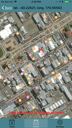
For these and some other controls, pushing a whole new screen makes more sense or is required because of the amount of contextual information necessary to adequately render that control; eg capturing photos, signatures/drawing, GPS map (geopoint/geoshape/geotrace). So, without any groups, the form is basically a long list of questions which you can fill in at any time in any order. Occasionally a particular control type will push a new screen, after which you'll pop back when finished.

Flow Control

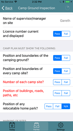
Because I dont force users to answer questions linearlly, controls anywhere in the form can appear and disappear while you are filling things in, according to their relevent logic. This is actually quite nice, because you get an immediate visual indication when something pops up because of how you answered a question; it's relevant context is obvious. Further, because there is no enforced order to answering question, any required but unanswered questions are highlighted in RED, so that you can quickly scan the form and see what remains. Finally, because there is effectively no 'end' of the form, there needs to be something to clearly indicate when the form is 'Complete'; that is, all required (and relevant) questions have been answered. For this I update a progress icon (pie chart) as you fill things in. When the form is done it shows a tick mark, indicating the form is now submit-able.

Finally, Groups

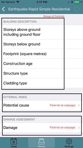
In regards to grouping, putting multiple controls in a group causes their respective rows to be displayed together in a section on the current page, with the group label becoming the section header. Again, this is a very common iOS UI design (basically UITableView rows and sections). This allows logically related controls to be visually grouped together in the same section on the page.

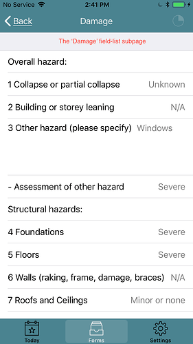
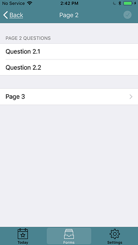
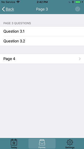
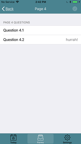
Putting all the controls on a single scrolling page, even after grouping some of them into sections, can still become unweildly when dealing with very long forms. And sometimes you simply want to display a bunch of related controls and/or groups together, distinct from everything else. For this reason I allow explicitly displaying controls/groups on different actual pages/screens, resulting in a multi-page form. To accomplish this I leverage the XForms field-list: defining a field-list starts a new page and everything under that field-list group, either individual controls or section groups (or even sub-pages!), will appear on that new page. The field-list group itself is represented within its parent page/group as single row containing the field-list name (ie page stub), with the usual chevron indicating that tapping on that row will drill down and open that page. Again, this is all standard, intuitive iOS behavior.

The real beauty of all this is that you can actually implement a full XForms hierarchy of pages, with each page possibly containing various different sections of related controls (ie XForm groups), which may in turn drill down to other sub-pages (ie XForm field-lists). Groups can contains subpages, subpages can in turn contain subgroups or further subpages, ...

Sequential Pages

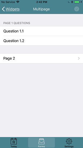
This page/group hierarchy can still support a more linear workflow, if desired, where you move through the form sequentially one page at a time (ala ODK Collect). It just requires a careful arrangement of pages and groups when defining your form. For example, the following XForm:

<h:body>
    <group>
        <label>Page 1 Questions</label>
        <input bind="q11">
            <label>Question 1.1</label>
        </input>
        <input bind="q12">
            <label>Question 1.2</label>
        </input>
    </group>
    <group appearance="field-list">
        <label>Page 2</label>
        <group>
            <label>Page 2 Questions</label>
            <input bind="q21">
                <label>Question 2.1</label>
            </input>
            <input bind="q22">
                <label>Question 2.2</label>
            </input>
        </group>
        <group appearance="field-list">
            <label>Page 3</label>
            <group>
                <label>Page 3 Questions</label>
                <input bind="q31">
                    <label>Question 3.1</label>
                </input>
                <input bind="q32">
                    <label>Question 3.2</label>
                </input>
            </group>
            <group appearance="field-list">
                <label>Page 4</label>
                <group>
                    <label>Page 4 Questions</label>
                    <input bind="q41">
                        <label>Question 4.1</label>
                    </input>
                    <input bind="q42">
                        <label>Question 4.2</label>
                    </input>
                </group>
            </group>
        </group>
    </group>
</h:body>

results in a form where the last row on each page takes you to the next page; eg having the 'Next Page' button at bottom of each page.

Or you can construct a similar XForm where the 'Next Page' button is at the top. In both cases the standard back button serves the purpose of 'Previous Page'.

The only caveat when constructing forms using these principles is that you have to be somewhat careful when nesting sections (ie XForm groups) within pages (ie XForm field-lists). Specifically, you cant have a section group immediately within another section group; instead they must be interspersed with a new page. [but you can have a page immediately within a page, the nested page simply appears as a single page stub row within its encompasing page].

There it is. Perhaps something here will help get the creative juices flowing around different ways you can display groups, field-lists, etc within a revamped Collect someday... :slight_smile:

BTW, I'm not suggesting this is necessarily the best approach to handling groups for ODK Collect; it is quite a different UI metaphor than what ODK enumerators have become used to (its fairly natural for iOS users because a lot of iOS apps take a similar approach to navigate up and down hierarchies of lists, especially the ubiqutious Settings app).

Personally speaking, I rather like being able to jump around a form easily and fill in things where and when as I prefer, rather than being forced into a predetermined linear process (but whether this freedom is good or bad for enumerators is another question...) Indeed, data availability may require that certain parts of the form be filled in out-of-order as circumstances dictate. So it is nice to be able to do this without having to 'back-track' thru the form step by step, only to have to retrace each step later.

With both current screen sizes and resolutions being much bigger than they were (and getting bigger each year), it could be time to start thinking about offering alternative UI metaphors for Collect, ones perhaps better optimized to the vastly superior screen real-estate now available with current mobile devices. I think we've moved past having to display one question per page.

Hi all,

this topic is something I'd like to contribute to so that we can use it ideally by September 2019.
In short, we have a workflow with about 6 repeating sub-groups, but the order in which these groups must be filled in is random.

In longer, we are tagging turtles, and might find (while gently wrestling with an angry 80kg flatback turtle with a beak that can take off your hand in semi-darkness on a tropical beach) any number of

  • existing PIT tags (like your cat would have) - 1 or 0
  • newly injected PIT tags - 1 or 0
  • existing flipper tags - 0 to 2
  • newly attached flipper tags - 1 to 2
  • some different types of samples

The handler yells out the data, and the scribe (who is ideally not the handler, but a second person) needs to capture the various groups in the random order they come in. There is no time to fumble through screens and "add another X group" prompts.

An ideal screen layout would be:

=========
Location widget
Other widets

GROUP NAME 1 (e.g. "PIT tag") --------------------- [add one]
[tag number "1234567890123456", action "observed associated with animal", status "operational"][edit][delete]
[tag number "1234567890123457", action "newly associated with animal", status "operational"][edit][delete]

GROUP NAME 2 ("Flipper Tag") --------------------- [add one]
[tag number "WB12345", position "left front flipper, scale 1", action "observed associated with animal", status "found loose, reclinched"]
[tag number "WB12346", position "right front flipper, scale 1", action "observed associated with animal", status "securely attached"]
[tag number "WB12347", position "left flipper, scale 2", action "newly associated with animal", status "securely attached"]

(repeated for other groups)

=====================

This provides overview of all filled in subgroups within one (scrolling) screen, and allows to edit, delete, or add any subgroup record with one button.

The complete fields of one subgroup is likely too long to represent cleanly as already existing record, but if we could represent existing subgroups through an xpath expression (e.g. "/data/pit-tags/tag-name" + "/data/pit-tags/tag-action" would result in "WB1234 found attached", "WB12345 newly attached").
The editable fields of a subgroup could easily be displayed underneath each other while editing, much like ODK Build shows groups nested within a green box.

Representing a group through a form-builder-defined xpath expression would also be useful as a standalone feature.