Collect: Improve geopoint dialog so it better highlights acceptable accuracy

I've been contact with some projects where data collectors just immediately accept the location that shows up with the default geopoint widget. This gets them 3000 meter accuracy, which is not great. One can add an accuracy constraint (selected-at(.,3) < 10), but it'd be better if we helped users understand better what their accuracy is.

It'd be better if we could adjust that dialog to better highlight acceptable accuracy values. I think the most effective way of doing this is with the blue circle that gets smaller as accuracy improves. The challenge is that the geopoint widget doesn't have a map view that you could use. Maybe that should change? Or maybe someone can come up with a more clever solution?

Something like a progress bar for accuracy? Like "location accuracy quality"

50% (3000m)
70% (100m)
80% (50m)
90% (20m)
95% (10m)
97% (5m)

I would totally wait to get a better "high score" if you showed me those made up percentages. Bonus if the progress bar changes colour (accessibility - eh) from red for too low to orange to green for "good enough" (as per default or form defined accuracy constraint).

Some untrained users on my end get confused as to when they can save (as soon as there's accuracy shown), when it would auto-save (when good enough), and when they can hit save to cut off a timing out GPS fix at the given (not good but also not further improving) accuracy.

So I would love to see (with better wording):

A message "You have to wait for a location fix before saving is possible" which disappears once there's a fix.

A button "you can save now with accuracy (progress bar)" as soon as saving is possible.

A message "This point will auto-save at xxx m accuracy (also indicated on progress bar)".

A message "Accuracy has not improved in the last xxx seconds, save now?". Not sure whether that's useful but it would provide relief to my untrained users if they are stuck with a coarser accuracy that just won't auto save.

2 Likes

Or just a way to highlight the accuracy shown in meters ?

1 Like

This might be slightly not related to the topic, but definitely related to the feature. GPS is a pretty confusing item for field workers, I have been observing since around 8 years of ODK deployments. What I do is that I put following as a HINT text in the form coding, which helps them understand how to respond to GPS' changing statuses:

Please turn on your phone's GPS/location feature, and wait for the location to lock automatically. You should preferably be outside any buildings, and under an open sky. This may take a few minutes, please be patient. 

Although GPS feature and accuracy has improved a lot recently, still it might be useful to provide similar guidance to the field workers for proper working.

Thanks,
Saad

2 Likes

We've been thinking about this recently and want to propose a new design for the default geopoint experience based on the feedback and ideas here.

The core change is to present the information to the enumerator slightly differently based on different categories of current accuracy: good (under 10m), poor (between 10m and 100m), terrible (over 100m).

Good:

Poor:

Terrible:

You'll see in each case we present the user with a qualitative assessment of the accuracy ("Poor accuracy") and an action ("Please wait") alongside the current accuracy. We've also tried to make it clear what the target accuracy is in all cases. The "Satellites..." text will be highlighted in red when the phone is connected to less than 4 (the required number for a fix) satellites. It might be that we want to explore using different actions/tips based on satellite number, the location provider being used etc.

In addition to tweaking the UI in Collect, we're also exploring making it easier to set a target accuracy and improving docs for geopoint.

Does it feel like these changes will help enumerators save more accurate points? Do the cut-offs we're using for each accuracy category seem about right?

2 Likes

Overall, I like where this is going!

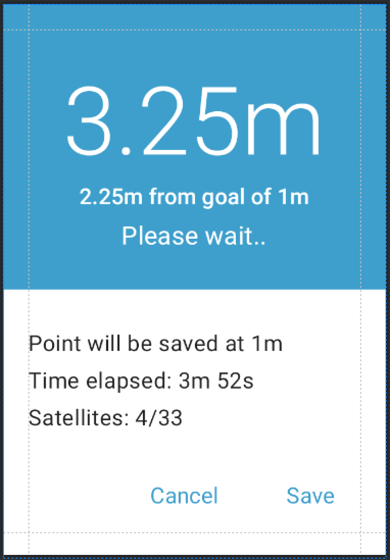
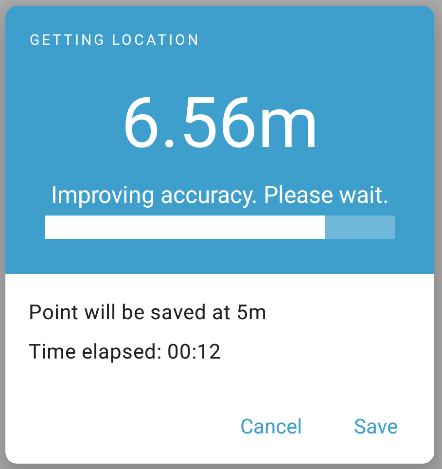
For Good, "Point will be auto-saved at 1m" feels clearer. "Auto" should be in there. And maybe instead of Point, we say Geopoint to match the launch button?

Time elapsed, I don't love, but I do think it's very useful for folks to know how long they've been waiting. The unit should probably be "min" instead of "m" because we use "m" for meters.

I'd remove the satellites. It's not actionable and I find it oddly technical and distracting. And with Android's fused provider, who knows what the underlying stack is doing. I'd love some pushback here if there's something I'm missing.

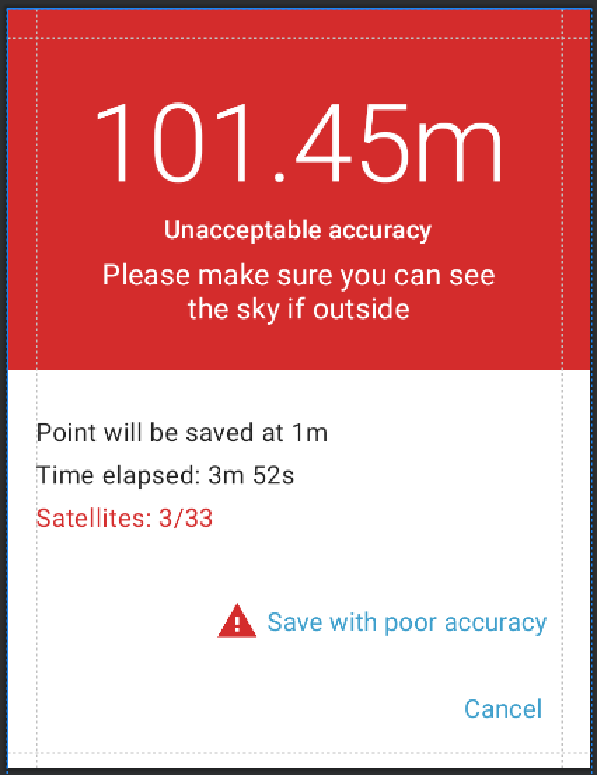
I think the red (or whatever accessible color we use) and a textual guidance "Please make sure your device can see the sky" (not sure about that exact wording) is great.

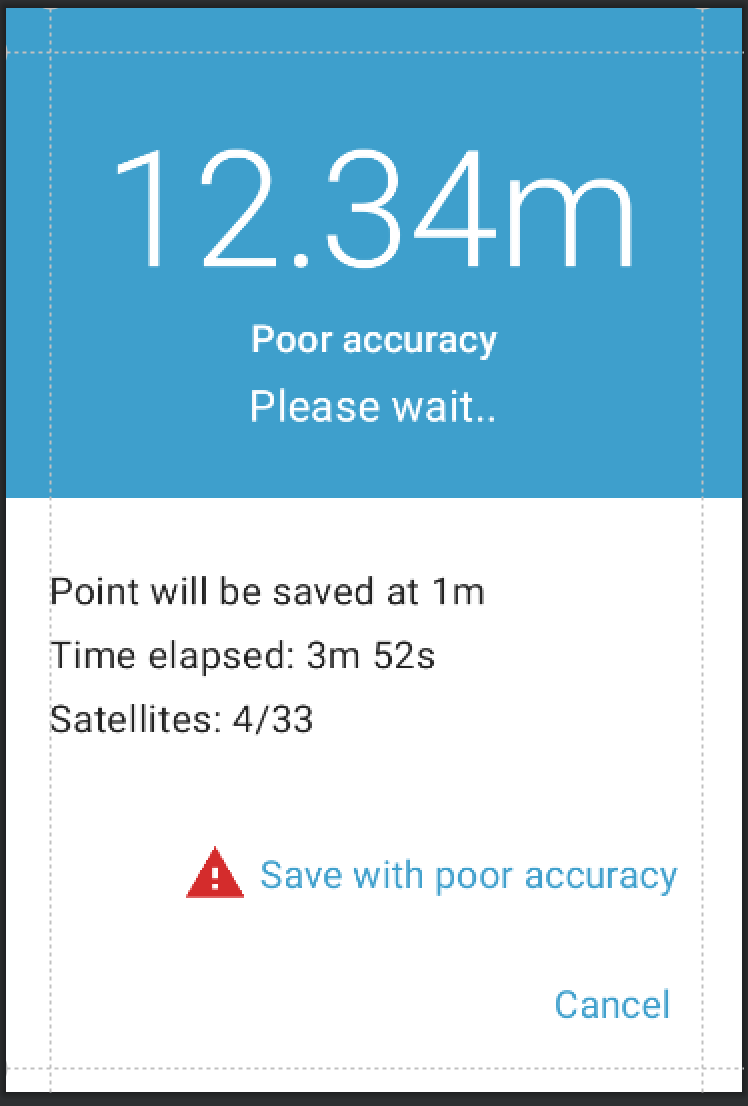
The font sizes are a little off given the information hierarchy. I'd expect the "Poor accuracy" to be the same size or bigger than "Please wait...". Or rather, flip the current font sizes you have for those two lines.

Instead of just "Please wait" it could be "Please wait for improved accuracy". It helps people know what they are waiting for.

For the Terrible, maybe the save text should say "Save with unacceptable accuracy" to match the rest of the dialog.

If you are a novice, one big thing that's unclear in the UI is what the big number is. You get to this dialog by hitting a Start GeoPoint button. It's a little confusing to get a number and you have no idea what that number is. One idea is that maybe we put the current lat/lon above time elapsed? And those values are blank until we get lock?

Finally, @seadowg, word on the street is that there'd also be changes to the screen that has Start Geopoint. That'd be good to see too so help contextualize these proposed changes. For example, accuracy might be the most important element on that screen and that would help this dialog be more intuitive for users.

1 Like

I really appreciate how the accuracy is clearly laid out for the user.
I would mention "Accuracy" as Yaw said to be clear on what the numbers are talking about.

Yes !
Maybe a "very good" level would be interesting (<1m).
And I'm not really a UI expert, but what do you think about color ramp from cold to warm with 3 or 4 colors for the 3 or 4 levels of accuracy.

I'm also not sure how interesting the information given by elapsed time and number is. But the "elapsed time" is used as a moving part showing that the phone is trying to get better accuracy - An animated image would have the same effect.

Finally, I think users have an "old and bad habit with" the "number of satellites" as they can't do anything with it. So i'm affraid they will be uncomfortable if collect doesn't mention it. Maybe it could be hidden when it doesn't make sense.

But if you have in mind such actions/tips based on satellite number, it make sense to mention it.

I like these tweaks. Will make a note and update the mock-up.

@LN had some good stories from the field about time elapsed helping to stop people closing early by reinforcing that they actually hadn't waited that long. It also gives us an easier way to debug problems as we can ask how long people are waiting. I think the real dialog uses min right now and it's just a mistake I made in the mock-up. Definitely interested in playing around with alpha pulse animations etc but we'll experiment with them once we have it on device.

I think we should keep this in unless we have a really good reason to take it out given some people rely on it.

That might make sense. Let's hold off on that level of pixel pushing until we have it working on a device.

Hmmm good point. Will have a think about this.

Haven't got to that yet. I think we want this dialog to be strong in isolation as well as people might hit save and then immediately swipe to the next question. Will be looking at revising the widget view itself but thinking of that as an add-on right now.

We're trying to avoid relying on color too much as it can have so many different connotations to different people and also introduces accessibility challenges. The two colors we're using already exist in the app and we believe have enough distinction that they'll imply a different between good/poor and terrible.

Nothing at the moment! Just wanted to mention that we can expand on that later.

2 Likes

Thanks @mathieubossaert and @yanokwa for all that helpful feedback. I like how @seadowg is planning to incorporate it.

Thanks also to the @TAB for a good discussion yesterday. I know I sounded tired in response to your feedback. It's because I'm tired. :sweat_smile: The feedback was good. We may not act on all of it immediately but I think the most helpful thing was to get confirmation that there's broad agreement this is a good area to improve. I'll do my best to address here what I remember was brought up. @Tino_Kreutzer in particular expressed eagerness at discussing further based on extensive training experience in the field. @Tino_Kreutzer do you want to set up 30 mins with me and possibly @seadowg?

Broad desire for animation
We played around with a number of animation concepts including @Florian_May's progress bar concept above and something like the accuracy circle shown on a map which @danbjoseph mentioned. We liked the ones that have a spatial representation but we think they only have meaning to someone with a mental model of maps and accuracy. Progress bar representations do seem like they'd lead to a more generic sense of "maximize the score". I believe that if you saw the dialog dynamically changing colors you'd feel that those do too.

We decided not to include animation for now because we didn't feel confident that they'd add value beyond colors. We also feel like the actual accuracy number would be important to display because some people do understand accuracy and may want to make a different decision at 10.5m vs. 9.5m for example (and likely also based on time elapsed). We have designed some analytics to try to validate that and further iterate as needed.

One idea a few folks mentioned and that I'm warming to is to add a new parameter to define the "unacceptable" cutoff. We picked 100m because it's about a city block and there are few contexts where this would be sufficient. But @chrissyhroberts points out that there are cases where maybe you're under heavy canopy and all you care about is the broad region you're in. Additionally, there are cases where you really want a high-accuracy point and maybe even 10m is unacceptable. Making the "unacceptable" cutoff configurable would give a lot more power to form designers. They could do things like define the automatic capture cutoff and the unacceptable cutoff the same to signal to data collectors that they should wait until auto capture.

Related to that, I'd like to make an additional suggestion to support an automatic capture cutoff of -1. This would mean that the point is never auto captured.

You wanted a point. Now you see a dialog with a ton of numbers and have no idea what any of it means.
This was particularly emphasized by @tomsmyth and it's something we've wrestled with. Our biggest group of Collect users is of the lightly trained type. But we also know we have very sophisticated users who benefit from the rich information provided when capturing a point. We tried to balance that by making the accuracy number really large and by putting the troubleshooting information smaller and on a white background. I'm hoping the font size changes @yanokwa described will further help. I'm open to ideas for de-emphasizing the troubleshooting information but I think we'd lose value by removing it.

3 Likes

I love the direction here. Just a few small ideas:

  • I think if you add a title to the dialog like "GPS Accuracy" that would go a long way.
  • I worry about the Save/Cancel buttons jumping around if the accuracy shifts back and forth across the "poor" threshold. You could perhaps just show an 'are you sure' prompt if someone actually hits 'Save' when the accuracy is poor.
  • I wonder if "Location will be auto-saved when accuracy reaches 1 metre" might be a little less confusing. I also am not sure how much "2.25m from goal of 1m" adds. Might be good to see if things feel less cluttered with that gone.
  • And/or you could do 'Time elapsed: 3:52' instead of '3m 52s'. Using 'm' for both minutes and meters in the same screen is bound to confuse. It confused me when I first saw it.
  • It might be a good idea to add a small spinner somewhere to reinforce that the system is doing stuff in the background.
1 Like

Thanks for these detailed suggestions and specs.

Spec changes
Setting an (un)acceptable threshold is a great idea. Allowing users to enter a number would be one approach, another would be to simplify the options (as we do for audio settings) and only pre-defined settings (e.g., high and low which could be something like 3m or 200m).

UX changes
I agree with @tomsmyth's feedback. As discussed on the TAB call, I'd recommend a much simpler interface that only gives enumerators the information they need. Lat / long, altitude, and precision can be shown in very small font (if at all). Check for example this altitude meter app for iOS: The progress bar goes from left to right with small feedback in text below in case GPS quality is poor, and a clear idea when it's getting better. Happy to chat on a call @LN.

1 Like

Taking a step back, I want to make sure that everyone remembers some alternative ways to capture location:

The value I see in having a user experience for capturing a point is that it enlists the judgment and training of the human being involved to get as good of a point as possible. Even with limited training, a person can react creatively given some information about what’s going on.

We added time elapsed and number of satellites after a series of field visits. I was convinced when I was handed three devices that seemed the same and took very different amounts of time to get location readings. I think there was a faulty chipset in this case and having a bit more information at least confirmed to the data collectors that something bad was going on. We saw a lot of that kind of variability in performance in getting location readings and data collectors trying to troubleshoot.

Looking at the screenshots you shared, it looks like you are thinking some high-level status information is sufficient? The challenge there is that as far as I know, we can’t produce meaningful, general-purpose status information. The fused location provider is a black box that may change with any release of Google Play Services. It combines many different signals. It could just say “please wait” but if that’s all you want maybe the background gps options are a better fit for what your context. Perhaps we could add configurability to start-geopoint so the target accuracy and a time limit can be specified.

Specifically, you mention not including accuracy. Accuracy is the thing we want to optimize for so if it’s not displayed I don’t think there’s value to having a human in the loop if that makes sense. Even if we add a message like “if you are outside, try moving to a place with a better view of the sky”, without knowing whether the accuracy radius is actually getting smaller, it’s not very actionable.

Here are some examples of things users can do with the current information:

  • move around and see whether that improves the accuracy radius
  • choose to capture a point manually once they get close to the target accuracy if some amount of time has gone by and the accuracy hasn’t improved
  • report a problem to their supervisor if they never get close to the target accuracy
  • ask a colleague whether location capture is taking as long as it is for them (“I’ve waited 3mins, do you have to wait that long?”)
  • evaluate whether anything is obstructing their view of the sky and move accordingly, seeing whether it changes the satellite count
  • report an issue if they can never see satellites

Some of these do require training to be consistently applied. But my experience is that when data collectors are motivated they can be creative beyond what their training or education level might suggest. Also some projects carefully evaluate the location capture characteristics of their devices and locations and develop protocols around those which they write up in their forms.

In my use cases, the acceptable accuracy changes over time. If we get auto-save within an acceptable waiting period, great. Else we save anything below 20m accuracy. This protocol is still surprisingly difficult to follow for some enumerators.

My ideal workflow:

  • If the accuracy falls below the auto-save threshold (5m) the point will auto-save and no further interaction is required. The widget should wait according to a new parameter wait-for-good-accuracy with a default of say 15 sec.
  • If we don't have auto-save with good accuracy after wait-for-good-accuracy seconds, save as soon as accuracy falls below acceptable-accuracy (let's say 20m).
  • If we don't have acceptable-accuracy after wait-for-acceptable-accuracy (30 sec), save with any accuracy.
  • If we don't have any accuracy (= no location fix), only then the user needs to act: cancel/wait/move around.

Having these new parameters means that the widget wouldn't need any technical information for users to act on, and the workflow would be "wait wait-for-acceptable-accuracy seconds else cancel/wait longer/use another widget (e.g. manual-map)".

What does it look like when they don’t follow it? Do they just capture location immediately? Something else? Do you know for sure that they didn’t try to improve accuracy? Is the protocol in eg the question hint?

Enumerators getting stuck at low accuracy have reported

  • waiting too long for each GPS fix - turning a 1h survey into 6 hours in hot and humid conditions
  • getting frustrated not knowing when it is OK to save

The GPS location is a mandatory field in our forms, so I only get successful location captures. We see very few aborted forms, and have no indication that enumerators have experienced a complete blackout of location capture.

Our question hint contains the protocol, but may be worded not concisely enough. Enumerators who are able and willing to read hints or even expand the guidance hints (a new feature this season) are not the ones getting stuck and frustrated.

Using newer tablets (Samsung Tab A 2019 8" and newly Samsung Tab A7 lite 8") and a start geopoint to warm the GPS means that most enumerators now get auto-save within 10 seconds.
My use case above might improve UX for folks on older devices and still make our location capture faster and more hands-off.

Side note: Audit (with auto location capture) is about to land in ODK Build (cough)

1 Like

@LN you're right, I meant accuracy.

Background capture is useful for some contexts. In our surveys we tell people to get a good GPS signal before going into someone's house, so they have to make sure it's recorded before the interview begins.

I don't disagree, training is needed to get a good location. My hope is that we can reduce the amount of training needed. Motivation isn't our problem, it's lack of understanding of the basics behind geolocalization. By showing fewer parameters and having a good graphical (or numeric) indication of what is a good vs a bad signal we can improve data quality and shorten time spent on training. So as you said, we shouldn't remove all the relevant numbers but I suggest we display them at the bottom to still allow troubleshooting (likely with the help of a more technical colleague in the field).

My main suggestion is to find a way for an indicative progress bar based on the current accuracy (in addition to the number) which changes color once it reaches the acceptable threshold. Numeric literacy has been a problem in our experience so while we can teach "wait for the number to be smaller than 100" some people forget what the number is and become confused and uncomfortable with this process.

1 Like

FWIW I really like this approach

Thank so much for the insights into scenarios you're familiar with, @Tino_Kreutzer and @Florian_May. @Tino_Kreutzer I apologize for not following up about a call. I figured you'd have your hands full! Plus, this thread has captured a lot of valuable information so would be great to keep the conversation here as we get close.

That's really great to hear. Let's see what you think of our first round of improvements and whether you think there's more necessary. I agree that the protocol you described is probably not needed anymore in general.

We've added a progress bar as suggested:

It has 5 steps each representing 20% of the bar:

  1. No location available: Trying to get location. Please wait. (this 20% is always filled when the dialog opens)
  2. Worse than unacceptable threshold (default 100m): Unacceptable accuracy. Please wait.
  3. Between unacceptable threshold and 5m before capture threshold: Poor accuracy. Please wait.
  4. 5m before capture threshold to capture threshold: Improving accuracy. Please wait.
  5. Currently the dialog closes when the bar is filled

This is now available in beta. To enable the new experience, please go to Settings > Experimental. You'll then need a form with a geopoint question in it such as the All Widgets form from the demo server. We look forward to your feedback!

One question we have is whether 100m feels like a good default for the unacceptable threshold. It corresponds to approximately a city block. There may be cases in which that is useful enough so we do want to make it configurable. However in the contexts and with the devices we’re familiar with we would expect that getting a better accuracy would be necessary and relatively quick.

5 Likes

A few comments here from someone who trains and leads field geologists using Collect for sample collection and relies on GPS signals.

I am not sure how the "accuracy" value is actually calculated or determined (GPS chipset? AndroidOS?) as in the past we looked at PDOP or similar semi-quantitative value to determine satellite constellation geometry and therefore an assessment of accuracy... and while I can fully understand the desire to keep the UX simple and clean, please keep options available for more technical users that need to know and record GPS location information, metadata, and have customizable thresholds (or none at all).

I'm not sure if anyone has considered this, and forgive me for jumping in late to the discussion here, but a feature that would be welcome on our side of things is the ability to have position averaging be an option. This can increase precision and most times accuracy for stationary recording. Even if averaged for 10-20 seconds. Food for thought as another feature request for down the road.

Cheers,
Carl

Thanks for chiming in @Carl_Schaefer! The change described here is only in the user experience for the geopoint widget. It's mostly rearranging information that's already there. The most significant change is to add one more type of feedback to data collectors: "this point has such a bad accuracy radius that it's unacceptable." That will by default happen with 100m+ accuracy but will be configurable.

You can read more about geo-related functionality in Collect in the documentation. In particular:

The accuracy radius is an estimate of what Android calls the radius of 68% confidence: there is a 68% chance that the true location falls within this radius. This is an estimate reported by the Android system based on the available sensors (GPS, network, etc). The accuracy radius itself may be more or less reliable depending on the sensor(s) used and current conditions.

We do not currently expose raw GPS values and don't intend to unless Android functionality significantly changes. According to our testing and field feedback, Google's fused location provider does consistently provide more precise points more quickly than raw GPS. Even in remote areas, it can use things like cell towers to improve the location estimate. It is the same provider used by Google Maps.

The downside of the fused accuracy provider is that we don't know the details of how it works and it gets continuously updated by Google. As far as we know and can tell by observing its behavior, it already uses techniques like averaging so it would not be appropriate to layer on. There is a discussion on point averaging here.

Folks with very high accuracy requirements typically need to use external hardware which is used through a secondary application. You can learn more in the documentation.

3 Likes